Factfulness: Ten Reasons We're Wrong About the World -and Why Things Are Better Than You Think by Hans Rosling (2018) Our very first blogpost on askyourdata.co from January 2017 was inspired by Hans Rosling's fact-based worldview and the tons of high-quality material and data the Rosling's and their fellows had piled together at gaprminder.org. Sadly, Rosling passed away in February 2017. One can go as far as to call Factfulness, Rosling's last book he had written with his son and daughter-in-law, his legacy. Factfulness is in essence a plea against seeing today's world in a "binary", black-or- white, rich-or-poor manner. One reflection of this are four generic income levels Rosling suggests instead of “rich and poor”. This is what Bill Gates, a personal friend of Rosling and fan of Factfulness says about that: Hans compares this [..] to standing on top of a skyscraper and looking down at a city. All of the other buildings will look short to you whether they're ten stories or 50 stories high. It’s the same with income. Life is significantly better for those on level 2 than level 1, but it’s hard to see that from level 4 unless you know to look for it. The main part of the book is structured along ten human instincts (e.g. fear instinct, size instinct etc.) that prevent us from fully perceiving the world as well as gradual developments and improvements as they are. Factfulness is not a mere 350-page-stream of undifferentiated optimism and positivity. Rosling names the threats and risks humankind is confronted with (climate change, global economic crisis etc.). A fascinating level of differentiation is maintained from the very first to the very last page. Thinking Fast and Slow by Daniel Kahnemann (2012) The fact that Daniel Kahnemann won a Nobel prize for economics in 2002 does not make this book a good read per se. In Thinking Fast and Slow, Kahnemann takes us on a tour de force through human thinking and decision making. The sheer quantity of insights Daniel Kahnemann and Amos Tversky, his main research partner who deceased in 1996, developed over time is breath-taking. Kahnemann shows us that there are essentially two ways of human thinking. The first system is fast thinking which happens almost automatically and instinctively. This is the predominant way of thinking. The second system is the one of slow thinking. It is capable of rational thought and conscious decision making but takes more of a person's energy and concentration. Kahnemann and Tversky have coined the research on cognitive biases. For instance, the two conducted the first study on the anchoring effect that drives the perception of figures and decision making on a subconscious level. This can serve as an interesting baseline for fundraising appeals (e.g. use large numbers in texts to increase average donations). Thinking Fast and Slow is the lifetime achievements of two of the most influential contemporary psychologists within one book. The hardcover is a 450page+ read, i.e. not something for a rainy autumn weekend alone. I can recommend the audiobook, particularly for a commute. There is an extensive amount of related material on the web. The Black Swan: The Impact of the Highly Improbable by Nassim Nicholas Taleb (2015) Nassim Nicholas Taleb's book has been a global bestseller of popular science since it was first published in 2008. Also Daniel Kahnemann refers to Taleb in Thinking Fast and Slow and admits that his thinking at a later stage of his career was strongly influenced by Taleb. Although the book has also be criticized by renowned reviewers for its partial lack of empirical evidence, intensive use of anecdotes and messy structure, we find it a worthwhile read. The key themes of the book are limitations of predictions and the occurrence of presumably “impossible events” – just like black swans were to Europeans before they were first sighted in Australia. Taleb was a successful Wallstreet trader and quantitative analyst before becoming a successful author. This is why he argues that the unexpected is not only key to the understanding of financial markets but of history as a whole. This “holisitic” attempt by Taleb might be aiming a bit too high. However, The Black Swan is a thought-provoking and entertaining read. Visual Display of Quantitative Information by Edward Tufte (2001)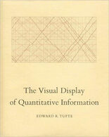 The history of data visualization goes back many centuries. In a world of growing „datafication“, the visual display of quantitative information is growing more and more important. We have dedicated a whole section of blogposts to this exciting topic. Edward Tufte’s book Visual Display of Quantitative Information is a highly valuable read for everyone that has to visualize data and communicate insights. Tufte advocates a quite radical „less is more“-approach when it comes to visualizing data. This means for example that, with insufficient data, a simple table might be preferable compared to creating any chart. If charts are used, no drop of ink should be wasted as Tufte continuously proclaims clarity, precision and efficiency in data visualization. The book is not only insightful for producers of quantitative information but also for recipients, i.e. basically everyone reading a management report, newspapers, blogs etc. Data visualizations can sometimes tend to distort the underlying information in order to be more persuasive. This is what Tufte calls the “lie factor”, i.e. the size of effect shown in the visualiation in relation to the effect size in the actual data. Visual Display of Quantitative Information is a very recommendable extension to every analyst's , data scientist's and information designer's library. Are there any books, papers, webinars and talks you can recommend for long and dark evening? Don´t hesitate to post comments and / or stay in touch with the team of askyourdata.co.All the best and read you soon, Johannes
2 Comments
 David Weber, BA Data Science & Analytics “If your only tool is a hammer, then every problem looks like a nail.” – Unknown. Today’s data science landscape is a great example where we need hammers, but we also need screwdrivers, wrenches and pliers. Even though R and Python are the most used programming languages for data science, it is important to expand the toolset with other great utensils. Today’s blog post will introduce a tool, which lets you leverage the benefits of data science without being native in coding: KNIME Analytics Platform. KNIME (Konstanz Information Miner) provides a workflow-based analytics platform that enables you to fully focus on your domain knowledge such as fundraising processes. The intuitive and automatable environment enables guided analytics without knowing how to code. This blog provides you a hands-on demonstration of the key-concepts. Important KNIME TermsBefore we start with a walkthrough of a relevant example, we need to declare some of the most important KNIME terms. Nodes: A node represents a processing point for a certain action. There are many nodes for different tasks, for example reading a CSV-file. You can find further explanations about different nodes on Node Pit. 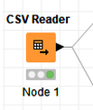 Workflow: A workflow within KNIME is a set of nodes or a sequence of actions you take to accomplish your particular task. Workflows can easily be saved and used by other colleagues. Even collapsing workflows into a single meta-node is possible. That makes them reusable in other workflows. 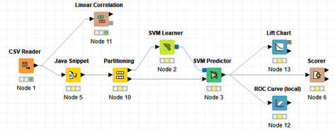 Extensions: KNIME Extensions are an easy and flexible way to extend the platform’s functionalities by providing nodes for certain tasks (connecting to databases, processing data, API requests, etc.). Sample Dataset and Data ImportFor demonstration, we are going to use a telecom dataset for churn prediction. This dataset could be easily replaced with a fundraising dataset containing information about churned donors. Customer or donor churn, also known as customer attrition is a critical metric for every business, especially in the non-profit sector (i.e. quitting regular donations). For more information on donor churn, visit our previous blog posts. Consisting of two tables, the dataset includes call-data from customers and a table about customer contract data. While using some of the information available, we will try to predict whether a customer will quit his subscription or not. Churn is represented with a binary variable (0 = no churn, 1 = churn). For visualization purposes, we are going to use a decision tree classifier, although there are probably even better classification algorithms available. First, we are using an Excel Reader and a File Reader to import both files. To make things easier, we use a Joiner node where we join both tables based on a common key. The result is a single table now ready for exploration and further analysis. 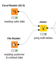 Feature EngineeringFeature Engineering is the process of analyzing your data and deciding which parameters have an impact on the label we want to predict – in this case whether a customer will quit or not. In other words: Making your data insightful. But before we look at correlations between the label and the features, a general exploration of our data is recommendable. The Data Explorer node is perfect for some basic information. One thing we notice is that we need to convert our churn label to a string, in order to make it interpretable for our classifier later. This can be done with the Number to String node. Now it’s time for some correlation matrices. We are able to see some correlation between various features and our churn label, whereas others do not correlate really. We decide to get rid of those.  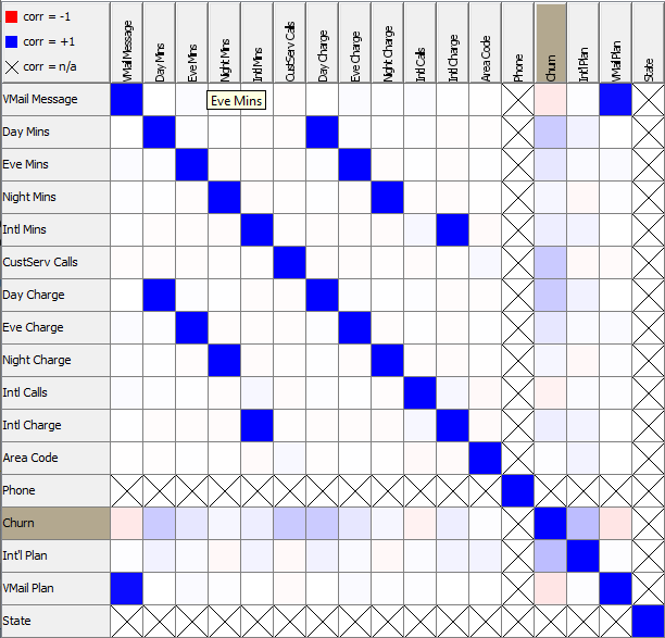 Model TrainingNow let’s start with the training of our model. But before we can do that, we need to partition our data into a training- and test-dataset. The training-set (mostly around 60-80% of our data) is used to train our model. The other part of our data will be used to test our model and to make sure it has prediction power. We can verify this with certain metrics. In this case, we will set the partition-percentage to 80%, which seems to be a good amount. This data will be fed into our decision tree learner. 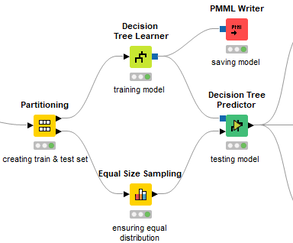 After some computing time, our finished decision tree looks like this: 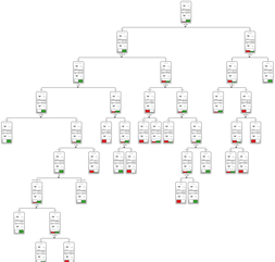 In order to make the model reusable and available for predictions with new datasets, we can save it with the PMML Writer node for later use. PMML is a format for sharing and reusing built models. If we want to, we can read the model later on with a PMML Reader node to make predictions with a new, unknown dataset. But before we use our model on a regular basis, we need to evaluate it with our test-dataset, which we split earlier. Model Prediction and EvaluationNow, testing our new model and evaluating its performance is one of the most important steps. If we can’t be sure that our model will predict right to a certain extent, it would be fatal to deploy it. So we feed the Decision Tree Predictor node with our test-dataset. This lets us see how the model performed. 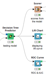 We have certain metrics within our KNIME workflow to fully evaluate it. First, we are using a Scorer node to get the confusion matrix and some other important statistics. Our confusion matrix gives us a little hint about threshold tuning, but the accuracy with 84% looks already pretty good. Our model predicted 29 cases as ‘no churn’, although they were actually ‘churning’. This number is rather high, so we should consider tuning our model parameter. 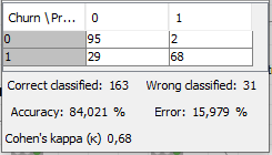 Next up is the ROC (Receiver Operating Characteristics) Curve. It maps True Positive Rates and False Positive Rates against each other. One of the results is the AUC (Area under the Curve) which adds up to a very good score of 0.914. A score of 0.5 (the diagonal in the chart below) represents prediction without any meaningfulness, because it means predicting randomly. 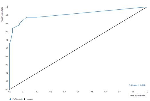 Additional metrics would be the Lift Chart and Lift Table, but an explanation would be beyond the scope of today’s blog. We think it’s time to summarize and draw a conclusion. Too good to be true?KNIME is a powerful platform, which provides various possibilities to extract, transform, load and analyze your data. However, simplicity has its limitations. In direct comparison with various R packages, visualizations are not as neat and configurable. And the ‘simplistic’ approach to data science limits possibilities in some way or another, requiring the user to have a thorough understanding of the data science pipeline and process. Further, most real life cases are more complicated and need more feature engineering and analysis beforehand – creating the model itself is mostly one of the smallest challenges.
Nevertheless, we think that KNIME is an awesome tool for data engineering / exploration and workflow automation (and building fun stuff with social media and web scraping). But if you are looking for complex models supporting your business decisions – KNIME won’t probably be the platform you are searching for. We hope you liked this month’s blog post and we would love to get in touch if you are interested in achieving advanced insights with your data or just want to dive deeper into the topic. If you want to know what Joint Systems can offer you concerning data analytics, this page will provide you with more information.  In last month's blogpost, we referred to the impactful Economist article stating that data is the new oil. One interpretation of this metaphor is that data can be seen as "fuel" for today's economy. This also applies to the nonprofit sector. The reference to oil does, however, not necessarily mean "digging for data" implies high costs in terms of acquiring and collecting it. There is quite some open data around which might be useful in a fundraising context. We see a broad range of possible use cases when it comes to open data in a fundraising context:
We will rush trough two hands-on examples to illistrate how to obtain, process and visualize open data with possible value for fundraising decision makers and analysts. Example 1: Visualizing income data on regional level Geographical disparities can be of relevance in the context of certain fundraising practices such as events or contact to High Net Worth Individuals (HNWI). Some regions are "wealthier" than others in terms of the respective average income levels. This information allows some conclusions about overall fundraising potential in a respective area. An aggregation level that we find useful and a good "common denominator" are the so-called NUTS regions the European Union uses. NUTS sounds like an English acronym, however, it is a French abbreviation and for Nomenclature des unités territoriales statistiques, in other words regional stat units. The European Union´s Statistics Office is called Eurostat. They offer a huge database that can be accessed online and is free of charge in most cases. We download not only data on the regional distribution on the level of NUTS2 areas but also use the specific R package eurostat. NUTS2 areas are quite "intuitive" in our eyes. In Austria, for instance, they reflect the federal provinces whereas Germany with its 16 provinces is split into 38 regions. For reasons of completeness, we show you how we searched for respective income data in the code snippet below. Our code is by the way inspired by this recommendable tutorial on eurostat. Code Snippet 1.1: Load libraries and search for data
The query above shows us 3 tables that contain income data. We decided to use the table with the index tgs00026, it contains data on disposable household income on regional level. Code Snippet 1.2: Obtain both income and geospatial data
We now have two dataframes, one for the income data with a regional variable and one for the actual geospatial data. We merge the two and dive into the visualization immediately: Code Snippet 1.3: Merge datasets into one and visualize data
As we already used a little French today, we are now able already to say voilà as the overview visualization we were striving for is finised and presentable: 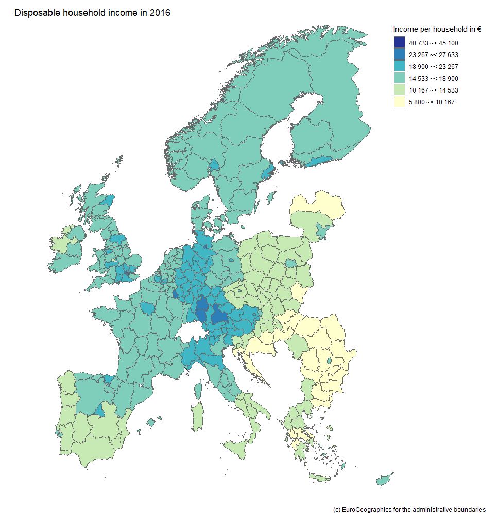 Example 2: What about large companies and their CEOs? The name Forbes might ring a bell if you think of listing the wealthiest people on the planet. Forbes also publishes data on the largest companies on an annual basis. We signed up at the platform data world - which we can also recommend - and obtained the 2018 dataset for the 2.000 largest corporations (here - signup is necessary). Luckily this data contains country information and also names the respective CEO - but step by step. As we are working with a flatfile, we did some data prep in it before loading it into R; we end up with a dataset that contains the following variables:
Code Snippet 2.1.: Read the file and select one country
So far, so good. We now have a condensed dataframe in R that contains the Dutch corporations that are listed in the Forbes 2000, i.e. 22 firms. We prepare a bubble chart with the company revenues and profits on the axes. The market value (mostly in shares) shall be reflected by the acutal size of the bubble. Code Snippet 2.2.: Draw the bubble chart
This is our result: 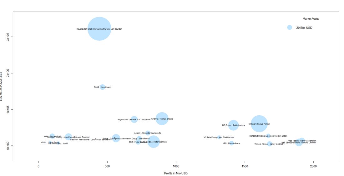
We can also spot a cluster of companies with high profit volumes in the lower right of the bubble chart. This cluster contains "big names" like Unilver but also contains firms that are not as widely known: 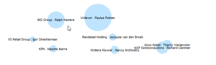 Even though it might not be so easy to meet some of the CEOs immediately, it might be worthwhile researching whether those big and powerful corporations have CSR departments, foundations etc. one can get in touch with. This was it for this month´s post. We hope you stay "open" over the summer break not only towards data but also our blog :-).   It was in 2017 when the renowned magazine The Economist wrote: "The world’s most valuable resource is no longer oil, but data." We set up our blog askyourdata.co in the same year. The topics of our articles vary from illustrative applications of models to fundraising data, discussions of topics like Artificial Intelligence for Fundraising to data visualization. The common denominator for our content is the context of charitable non-profit organizations. We think that the tools and methods of advanced analytics and data science can contribute to the effectiveness and efficiency of fundraising organizations. This is why we started wondering whether there are empirical findings on the state of data science and advanced analytics in data science. Good news: We found results that are both recent and interesting. Data Science starts with data. Back in 2016, the American software company EveryAction surveyed some 460 professionals (presumably mainly in the US; the complete study can be downloaded here) from non-profits about their habits, culture, and outlook on the state of data at their organizations. Some key findings:
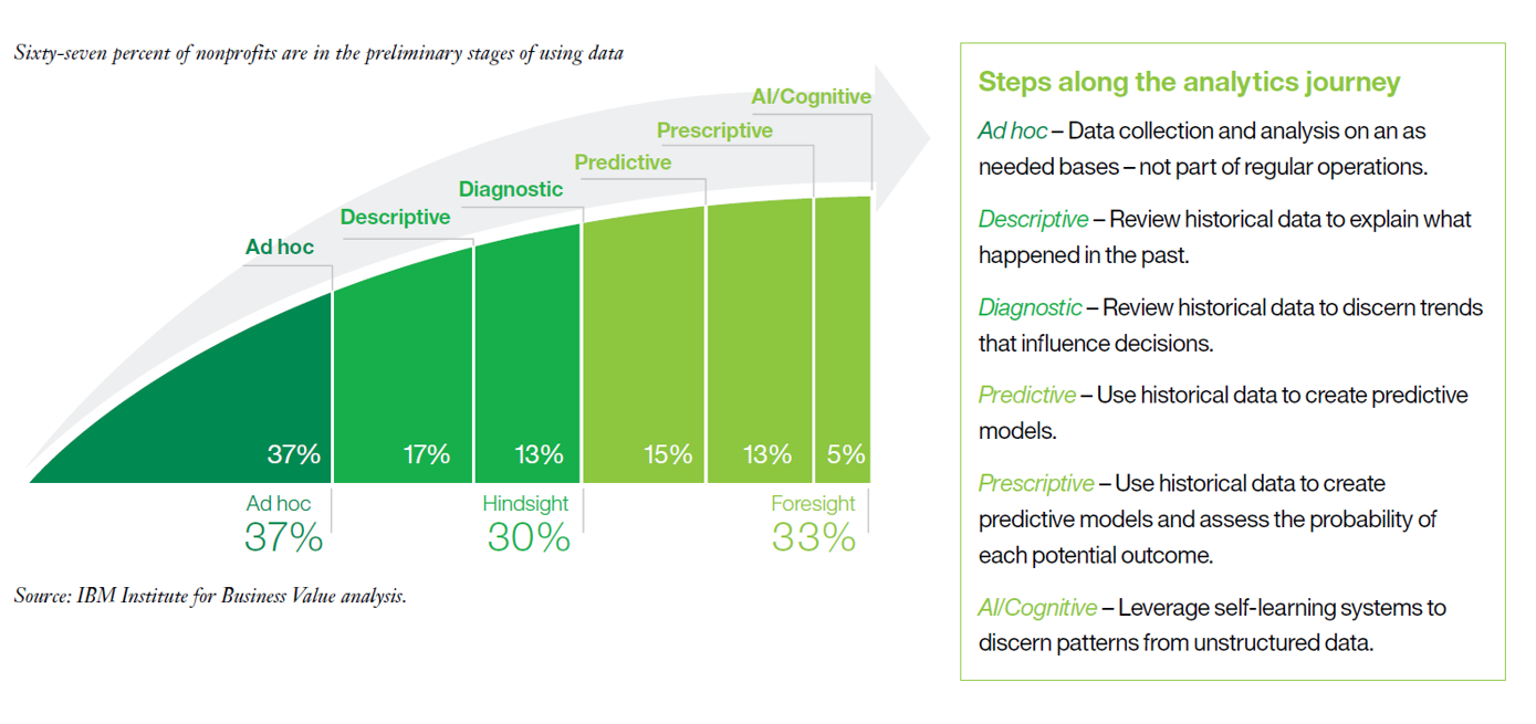 A bit more than two-thirds of the respondents conduct ad hoc or (ex post) hindsight analysis (descriptive, diagnostic) whereas the remaining third has stepped into advanced analytics (predictive, prescriptive, AI / cognitive). Having mentioned the term “advanced”, one should not forget about the speed of developments. What might have been considered “advanced” a few years ago might turn into the "standard level" sooner or later. The probably most interesting insight from the survey is that respondents with more advanced analytics capabilities reported higher effectiveness than others on three important metrics (Improve performance against mission, Achieve operating efficiencies, Improve staff productivity). In other words: Non-profits with deeper data capabilities see stronger impact, transparency and decision making. 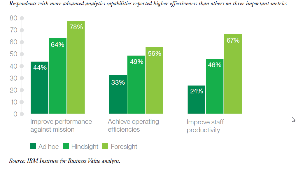 Like the aforementioned study by EveryAction, the IBM survey asked for primary barriers to advancing data and analytics. These are:
What about data science in the non-profit sector? We did not come across specific studies on the state of data science in the non-profit sector in general or fundraising more particularly. However, we had a closer look at the industry segmentations in two major data science surveys. JetBrains polled more than 1.600 people involved in Data Science in the US, Europe, Japan and China (download full study here). One of the questions asked for the industry for which the respondents analyse data. The non-profit sector ranked quite low (5% compared to Accounting / Finance / Insurance and Science with both 16%). This finding can be seen as consistent with the results of the aforementioned studies that diagnose scope for advances in the field of non-profit analytics. The presumably most comprehensive study on the state of data science and machine learning is the annual Machine Learning and Data Science Survey conducted by the platform kaggle.com. Kaggle surveyed almost 24.000 people in October 2018, the results are therefore quite recent. In line with open data thinking, the raw data containing the survey results can be downloaded from the site, there is also a data analysis competition attached to it. The non-profit related results in a nutshell: Of some 24.000 respondents, only a tiny fraction of 0.79% (189 respondents) answered that they work or recently worked for an employer in the non-profit industry. Regardless of the fact that the sample might not be fully representative across industries, this figure shows that data science is still in its beginnings in so-called third sector.  When it comes to the regional distribution of non-profit data scientists, it is striking that a third of respondents that said that they work for nonprofits reside in the United States. India is the runner-up with some 10 percent. The numbers of the remaining countries with respondents is quite evenly distributed. 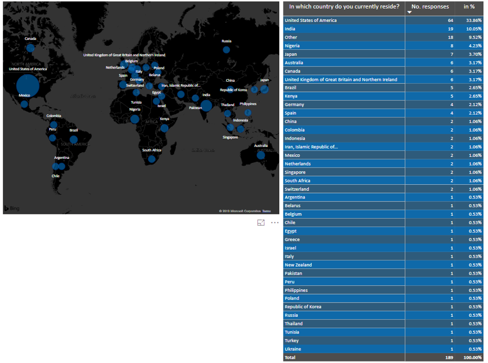 Our conclusion: Non-profit representatives and decision makers are largely aware of the potential benefits that use of advanced analytics and data science might imply for their organizations. Building competencies, structures and systems is often challenged by scarce resources (most prominently budget but also expertise). The answers regarding the presence of data scientists surveyed by JetBrains and Kaggle reflect this state. The good news is: Nonprofits need not feel alone in their advanced analytics endeavours, as outlined by IBM who advocate establishing an insight ecosystem. 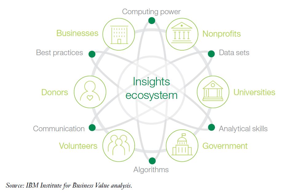 If you are interested in building your own insight ecosystem, you might wish to learn more on what joint systems can offer in this regard.
Let us stay in touch! We wish you a nice rest of spring.  Landscape sculpture called "Dear Leader" created by Edward Tufte Landscape sculpture called "Dear Leader" created by Edward Tufte Visualizing data is an integral part of analysts´ and data scientist’s day-to-day life. Visualizations are not produced for the sake of beauty and design – at least not exclusively. One could say the common denominator for data visualization is to make it easier to process information for the human brain and therefore for the recipients. This might lead to better decision making (this is what is often called actionable insights), meaningful storytelling (e.g. in the area of data journalism in general but maybe also particularly in the context of NPOs) and the increase of so-called data literacy. One may like it or not but we live in a highly quantified society which means that often also "non-quantitative“ professionals across industries are required to consider data. The final product that analysts are asked for by recipients are often charts and infographics. Visualizations also play an important role in the course of data science projects. In line with CRISP DM thinking, it is often data visualizations that help develop the so-called data understanding. Modern tools such as good old Excel or more integrated and holisitc solutions like Power BI make it possible to process large amounts of data from different sources with relative ease and in short time. We can therefore draw a preliminary conclusion: The need for visualization of data will persist and steadily grow, modern tools make life significantly easier in this regard. But what does it actually mean do come up with good data visualizations?  The good news is: There are various sources and thinkers one can turn to get inspirations and recommendations in the context of data visualization and information design. In this month’s blog post, we will take a close look at the work of Edward Tufte. Tufte is an American statistician and professor emeritus of political science, statistics, and computer science at Yale University. He is one of the most influential contemporary thinkers in the field of information design and data visualization. The New York Times went as far as to call him the “Da Vinci of Data” in 1998. More than 35 year ago, Tufte published the first edition of The Visual Display of Quantitative Information which has become a classic on statistical graphics, charts, tables. Tufte is also known for some easy to remember quotes such as: "If the statistics are boring, then you've got the wrong numbers." Tufte has coined the idea of Graphical Excellence. Graphical Excellence means the efficient communication of complex quantitative ideas towards recipients. This requires clarity, precision and efficiency. What does efficiency mean in this context? The viewer should be given the greatest number of ideas in the shortest time with the least ink in the smallest space. You could say this is the application of a minimalist and “less is more” philosophy in the context of data visualization. Graphical excellence is the well-designed presentation of interesting data - a matter of underlying data, of statistics and of design. One could say in data visualization, data is not everything but without the appropriate data, everything is nothing. Data and the messages derived from it have to be correct. Tufte uses the term integrity in this regard. There is a plethora of sources on how to lie with statistics. Data has to be relevant for the respective viewer. As mentioned above, Tufte went as far as to say that if the statistics are perceived as boring, then you've got the wrong numbers. When it comes to design, Tufte suggests the following things that graphics should do:
"Design cannot rescue failed content!" ... is another striking quote by Tufte. We tried to put togehter an interesting (hopefully!) slideshow with some "evergreen" data visualizations and inspiring works from the recent past. Have a look, enjoy and read you next time!  Recently, the average media consumer could get the impression that Artificial Intelligence (AI) is the next big thing and that it will coin our daily lives in the near future. Numerous developments are currently discussed in newspapers and magazines, TV debates, blogs etc. Some of these developments are said to bring about significant, sometimes even radical changes to different industries, be it health, finance, production etc. The question is: Will charitable fundraising remain unaffected by these big shifts and everything will stay as it is? We have our doubts but definitely see the need for a differentiated view at the same time. This month’s blog post will provide a quick introduction to artificial intelligence and reflect on it current and possible future role in the context of fundraising.  What is Artificial Intelligence So, what is Artificial Intelligence? Even a quick web research delivers numerous definitions of which many show certain overlap. Let us proceed with one definition by digital evangelist Ray Kurzweil who said that AI ist the art of creating machines that fulfil tasks that – if they were carried out by humans – would require intelligence. The pictures that come to people´s minds should not be underestimated when it comes to a broader understanding of AI. It can be assumed that many think of so called strong artifical intelligence when they hear the term AI. Strong artifical intelligence implies by definition machines that are actually intelligent just like Data from Star Trek, C3PO from Star Wars or Bender from Futurama. The real-life form of artifical intelligence is so called weak artifical intelligence, machines that show intelligent behaviour to some degree. Weak AI essentially means rule-based systems that have capacity for machine learning. AI history in a nutshell The beginnigs of AI go back to the early days of modern information technology. You might know Alan Turing from your studies and/or the movie The Imitation Game (showing how Turing and his fellow experts significantly contributed to the Allied victory in WWII). He suggested a test now named after him to find out whether the respective opposite is a machine or a human. In the same year, Isaac Asimov wrote the novel I, Robot and suggested the Three Laws of Robotics. Asmiov´s work is a good example of the overlap between technoclogical advances in AI and their dramatization in popular culture. From the beginning oft he 1950ies onwards, AI technology evolved gradually, It was, for instance, as early as 1974, i.e. 45 years ago, when the Stanford AI lab introduced the first prototype of a self-driving car. A growing audience saw Deep Blue beat chess world champion Gary Kasparov in 1997. A bit more than a decade later, in 2011, Siri, Google Now und Cortana were introduced almost at the same time. What about the future? There are developments than can be forseen. Sooner or later self driving cars will be introduced, translation algorithms as well as image and text recognition will gradually become better etc. When it comes to the long-term perspective, there are different positions. Elon Musk, from Tesla for example goes as far as to term AI as a potential threat to the existence of the human race. Andrew Ng, a machine learning evangelist, says that fearing the rise of killer robots is like worrying about overpopulation on Mars.  What are the functions of AI? To put it in an anthropomorphic, i.e. human-like sense, AI can nowadays do the following:
From a more functional perspective, AI capabilites can be summarized as follows:
It has to be moreover noted that AI is not a monolithic and distinct technology but a bundle of different technologies, methods and algorithms. This is reflected by the different sub-areas:
Although AI is an ambiguous field, there are certain research areas and big topics that can be identified:
What AI is able to do - and how it might change the game Many think tanks, consultancies and companies deal with the future potential and development of AI across industries. A quite recent study by Mc Kinsey deals with the impact of AI on different sector and functions. AI can do an impressive lot of things nowadays, be it agriculture, medicine, finance, law etc. Business Insider have put together a compact list with some 50 examples, all with a link for further reading. Expectation levels are definitley high when it comes to the potential of AI– which brings about the risk of exaggerated hopes and fears at the same time. Inspiried by a blogpost on datasciencecentral, a blog we can really recommend, we find it worthwhile to reflect on 6 common myhts regarding AI:
 So what? The case of charitable fundraising organizations To put it very generically, FR organizations can be seen as entities that link needs (be it children at risk, endagered animals or the environment) with supporters. As a consequence, there are three major pillars – the need, the oranization and the supporters (or, to be exact, the communication and interaction with them) in which AI might contribute. The need We found three inspiring examples from different organizations how AI – also at small scale and in a hands-on manner – can contribute close to the need of charitable organizations.
The organization and its processes This is the „internal“ view and it is therefore hard to find promiment good practice examples on the web. Generally speaking, AI has the potential to help improce payment processes, fulfilment processes, etc. These processes are often rather „generic“ to a certain extent and therefore comparable to the profit sector – which is an opportunity when it comes to available tools, expertise etc. Donor Communication and Fundraising Many topics we have covered in this blog so far, be it churn analyses, donor clustering, dealing with unstrcutured data, data visualization etc. can be attributed to artificial intelligence in a broader sense and can be potentially applied in afundraising context. AI in fundraising might therefore mean using advanced algorithms and data science methods for donor data. There are also other applications of AI in todays fundraising context. The American version of Amazon’s Alexa is now able to trigger donations through voice commands. Numerous organizations have started using chatbots to enhance their touchpoints with donors. So, what to do now? Public Enemy already rapped “Don’t believe the hype” in 1988. So, should the fundraising sector lean back and watch other industries chasing after supposed AI innovation? We do not think so - but instead of thinking about big investments in the first place, we find it recommendable gradually start building know-how, run tests and create prototypes at a smaller scale. If you need support or resources, get in touch with a reliable partner that knows your organizations and whom you have a sustainable relationship with. As far as conferences, blogs, books etc. about AI are concerned, there is nothing that holds one back - so why not start dealing with AI for fundraising in 2019?  Speaking of 2019: As the year is still quite young, we wish you and your colleagues a happy, healthy and successful new year! P.S. for joint systems clients: This blog post is an extract of a keynote I have delivered recently. Please do not hesitate to get in touch if you are interested in diving deeper into the topic or learning about our service and product portfolio.  |