 In last month's blogpost, we referred to the impactful Economist article stating that data is the new oil. One interpretation of this metaphor is that data can be seen as "fuel" for today's economy. This also applies to the nonprofit sector. The reference to oil does, however, not necessarily mean "digging for data" implies high costs in terms of acquiring and collecting it. There is quite some open data around which might be useful in a fundraising context. We see a broad range of possible use cases when it comes to open data in a fundraising context:
We will rush trough two hands-on examples to illistrate how to obtain, process and visualize open data with possible value for fundraising decision makers and analysts. Example 1: Visualizing income data on regional level Geographical disparities can be of relevance in the context of certain fundraising practices such as events or contact to High Net Worth Individuals (HNWI). Some regions are "wealthier" than others in terms of the respective average income levels. This information allows some conclusions about overall fundraising potential in a respective area. An aggregation level that we find useful and a good "common denominator" are the so-called NUTS regions the European Union uses. NUTS sounds like an English acronym, however, it is a French abbreviation and for Nomenclature des unités territoriales statistiques, in other words regional stat units. The European Union´s Statistics Office is called Eurostat. They offer a huge database that can be accessed online and is free of charge in most cases. We download not only data on the regional distribution on the level of NUTS2 areas but also use the specific R package eurostat. NUTS2 areas are quite "intuitive" in our eyes. In Austria, for instance, they reflect the federal provinces whereas Germany with its 16 provinces is split into 38 regions. For reasons of completeness, we show you how we searched for respective income data in the code snippet below. Our code is by the way inspired by this recommendable tutorial on eurostat. Code Snippet 1.1: Load libraries and search for data
The query above shows us 3 tables that contain income data. We decided to use the table with the index tgs00026, it contains data on disposable household income on regional level. Code Snippet 1.2: Obtain both income and geospatial data
We now have two dataframes, one for the income data with a regional variable and one for the actual geospatial data. We merge the two and dive into the visualization immediately: Code Snippet 1.3: Merge datasets into one and visualize data
As we already used a little French today, we are now able already to say voilà as the overview visualization we were striving for is finised and presentable: 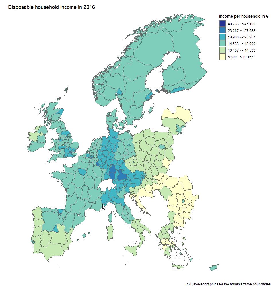 Example 2: What about large companies and their CEOs? The name Forbes might ring a bell if you think of listing the wealthiest people on the planet. Forbes also publishes data on the largest companies on an annual basis. We signed up at the platform data world - which we can also recommend - and obtained the 2018 dataset for the 2.000 largest corporations (here - signup is necessary). Luckily this data contains country information and also names the respective CEO - but step by step. As we are working with a flatfile, we did some data prep in it before loading it into R; we end up with a dataset that contains the following variables:
Code Snippet 2.1.: Read the file and select one country
So far, so good. We now have a condensed dataframe in R that contains the Dutch corporations that are listed in the Forbes 2000, i.e. 22 firms. We prepare a bubble chart with the company revenues and profits on the axes. The market value (mostly in shares) shall be reflected by the acutal size of the bubble. Code Snippet 2.2.: Draw the bubble chart
This is our result: 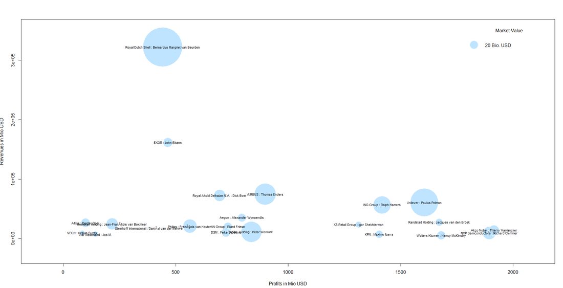
We can also spot a cluster of companies with high profit volumes in the lower right of the bubble chart. This cluster contains "big names" like Unilver but also contains firms that are not as widely known: 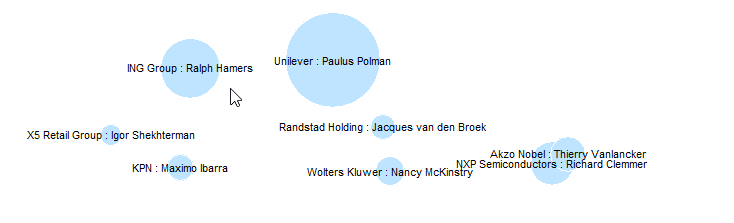 Even though it might not be so easy to meet some of the CEOs immediately, it might be worthwhile researching whether those big and powerful corporations have CSR departments, foundations etc. one can get in touch with. This was it for this month´s post. We hope you stay "open" over the summer break not only towards data but also our blog :-). 
0 Comments
|