|
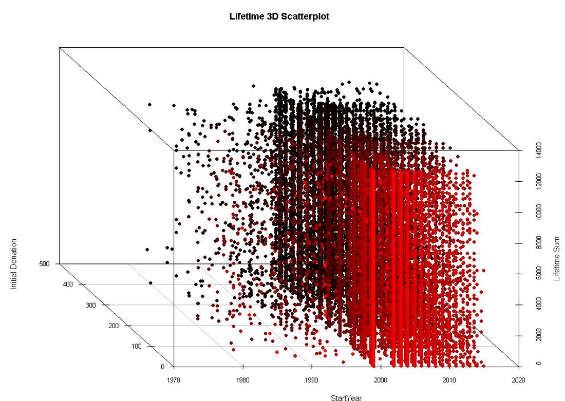
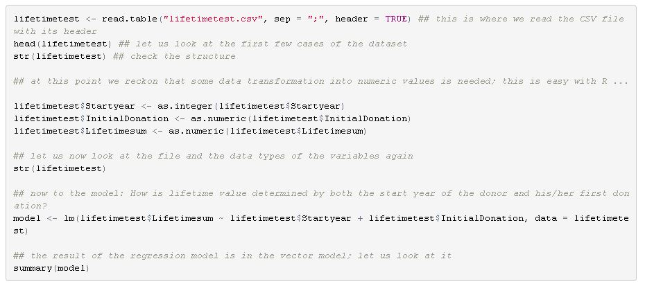
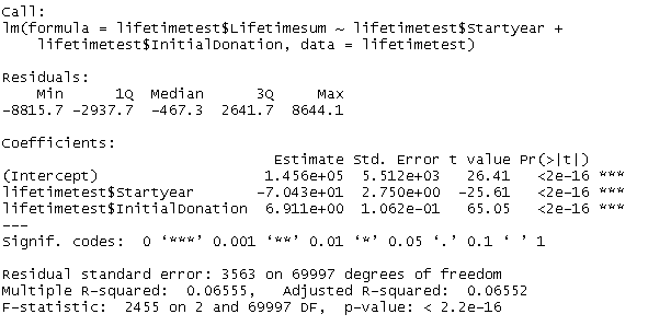
It was in 1875 when Sir Francis Galton, a Victorian polymath and cousin of Charles Darwin, asked seven friends for a favour. He sent them sweet pea seeds, asked to plant them and send back seeds from the following generation of peas back to him. Galton then started plotting the sizes of the new peas against the ones of the mother peas from the first generation. What Galton ended up with was not only a visualization of a linear relationship between the pea sizes of the two generations but also an early illustration of what we still know as linear regression. Galton’s thinking was built upon earlier works. The method of least squares for example was coined by Legendre and Gauss in the early 19th century. What´s more, multiple regression, the extension of the simple linear regression that takes more than one independent variable into account, was developed later. However, regardless of the thinking developed before and after (and Galton’s highly questionable ideas in the area of eugenics – but that is a different story …), the pea experiment can be seen as an emblematic moment in the history of data science. There is tons of books, papers and digital material on linear regression. Many of you might have come across the method in one way or the other during their higher education. If this is quite some time ago or it is your first time dealing with regression, this might be a straightforward introduction video. The more advanced form of Galton’s regression approach and the most common form of linear regression analysis is multiple linear regression. Multiple linear regression aims to explain relationships between one continuous dependent variable (also called response) and two or more independent variables (called predictors). Multiple linear regression is not only used to explain linear relationships but also predict outcomes of dependent variables, given that the independent ones can be observed or calculated. How can regression models be helpful in the area of fundraising analytics? There is definitely a number of dependent variables we are highly interested in when it comes to investigating factors that drive them or even the possibilty to predict them with a certain confidence. Let us work through a simplified example on donor lifetime value that I conducted with the software R. I used a sample dataset with 70.000 records I had randomly made up before. The dataset contains the variables DonorID (non-suprisingly the unique identifier of a sample donor), StartYear (the year the supporter relationship started), IntitialDonation (the amount of the initial donation in local currency) and Lifetimesum (the accumulated lifetime donation amount per donor). Let us investigate how lifetime value (Lifetimesum) is driven by the length of the supporter relationship (operationalized via StartYear in our simplified example) and which influence the first ever donation (IntitialDonation) has. As we are dealing with three variables, we have the chance to plot the variables in three dimensions jus for fun: I used the library scatterplot3d to create the visualization above: Regardless of the visualization we don´t learn much about the relationships between the variables by looking at the graph. It is far too complex and dense. A independent variable would make plotting impossible anyway. So let us turn to the actual modelling: Where does this take us? Although there would be a lot of things to say about the results and their interpretation, we focus on key results: The start year of the donor seems to have a negative influence on the lifetime value. The coefficient is -70,43 (note the scientific notation). This result is intuitive - the longer you are there as a donor the longer you have time to accumulate lifetime value. In other words, the higher your start year is, the lower your lifetime value tends to be.
The initial donation has a positive effect on lifetime value (coefficient 6,91). This does not surprise us either as the initial donation is a component of the lifetime value. Both results are significant. The R-squared, a measure of how much of the total variation is explained by the model, is fairly low (0,066 on a range between 0 and 1). So: More reflection and conceptualization to be done ... I decided to refrain from listing caveats and possible ambiguities (such as intercorrelation of predictors, the underlying assumptions etc.) for regression models in this post as there is great material you can go through if you want to do some further reading or want to dive deeper into the method. Last, not least it is of course not R alone where you can start playing around. Even Excel and of course tools like SPSS, SAS etc. will let you play with your data. So go ahead - and share your insights if you like :-)!
0 Comments
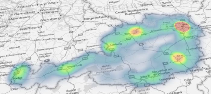
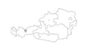
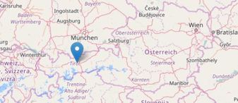
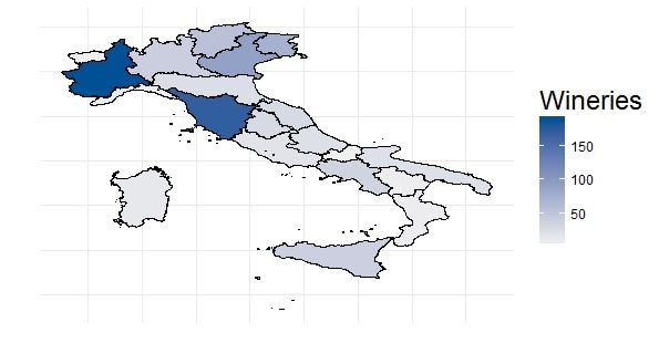
 Varanasi, India Varanasi, India Sometimes maps are a suitable mean or even necessary tool to visualize data. A vast number of software is available for what is often termed location intelligence. Renowned applications like ArcGIS from Esri, the tools from Pitney Bowes or Tableau are powerful - but are of course not available for free. If creating maps is not really an essential part of the analytics you do on a regular basis but maps are the tool of choice once in a while, there is a number of alternatives one can look at. Good old MS Excel includes a functionality to visualize map data since version 2016. As soon as the data is ready in Excel (I used data from Statistics Austria for population on postcode level) it is fairly easy to create different types of plots. The picture shows a heat map (i.e. the closer an area is to red, the higher it is populated). 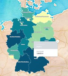 I also came across a cloud-based platform called Carto. It took me some hours to get used to the handling of base data and map styling. After a while it got easier and easier, looking backwards it is a straightforward and intuitive tool. I used data from Destatis (the German equivalent to Statistics Austria) to obtain population data on federal province level. The nice thing is that generated maps can be published and embedded online which I have done here. Last, not least there is a number of R packages available that aim to make the data scientist´s life easier when it comes to spatial data. The package ggmap which is a package for creating maps with ggplot2 (the plotting workhorse of R) is worth mentioning in this context. I also found leaflet, which brings open-source JavaScript libraries particularly interesting (see pciture below on the right). It is actually also possible to do some basic plotting without any further ado using R “standard” (see left map). There are also country-specific map packages around. A very nice example I have found is from Italy and plots the number of wineries per region (and made me think when the next trip to Italy might be :-) If you are interested in R Code or how-to-information, please do not hesitate to get back. I´d also look forward to shared experiences with mapping tools, spatial data etc. Just go ahead and comment :-)!
|
Categories
All
Archive
June 2024
|
