Moneyball Released: 2011 Big names: Brad Pitt, Philip Seymour Hoffman IMDB Rating: 76% Plot in a nutshell: The movie is based on the book Moneyball: The Art of Winning an Unfair Game by Michael Lewis. Its main protagonist is Billy Beane who started as General Manager of the baseball club Oakland Athletics in 1997. Beane was confronted with the challenge of building a team with very limited financial resources and introduced predictive modelling and data-driven decision making to assess the performance and potential of players. Beane and his peers were successful and managed to reach the playoffs of the Major Leage Baseball several times in a row. Trailer: Why you should watch this movie: Moneyball highlights the importance of communication skills and persistence for people aiming to drive change using data science. The Imitation Game Released: 2014 Big names: Benedict Cumberbatch, Keira Knightley IMDB Rating: 80% Plot in a nutshell: The Imitation Game is based upon the real-life story of British mathematician Alan Turing who is known as the father of modern computer science and for the test named after him. The film is centered around Turing and his team of code-breakers working hard to decipher the Nazi German military encryption Enigma. To crack the code, Turing creates a primitive computer system that would consider permutations at a much faster speed than any human could. The code breakers at Bletchley Park succeeded and thereby not only helped Allied forces ensure victory over the Wehrmacht but contributed to shorten the horros of the Second World War. Trailer: Why you should watch this movie: It is a (too) late tribute to Alan Turing. Turing was prosecuted for his homosexuality after WWII and eventually committed suicide. The film is also about the power of machines and ethical perspectives in analytics Margin Call Released: 2011 Big names: Paul Bettany, Stanley Tucci, Demi Moore IMDB Rating: 71% Plot in a nutshell: Margin Call plays during the first days of the last global financial crisis in 2008. A junior analyst at a large Wall Street investment bank discovers a major flaw in the risk evaluation model of the bank. The story develops during the night as the young employee informs senior managers that the bank is close to a financial disaster, knowing that the bancruptcy of the firm would lead to a dramatic chain reaction in the market – and millions of lives would be affected. Trailer: Why you should watch this movie: The film depicts to what extent algorithms dominate decision making in the financial industry. It also portrays the interplay between supposedly objective models and human beings driven by emotions and interests. 21 Released: 2008 Big names: Kate Bosworth, Laurence Fishburne IMDB Rating: 68% Plot in a nutshell: Six students of the renowned Massachusetts Institute of Technology (MIT) get trained in card counting and rip off Las Vergas casinos at various blackjack tables. The film is based upon a true story. Trailer: Why you should watch this movie: It is an entertaining and fun movie. In addition to that, it contains some interesting mathematical concepts such as the Fibonacci Series and the Monty Hall Problem. We hope our tipps are valuable for you and you enjoy any of the flicks. 📺🎬 🍿☕🍷
|

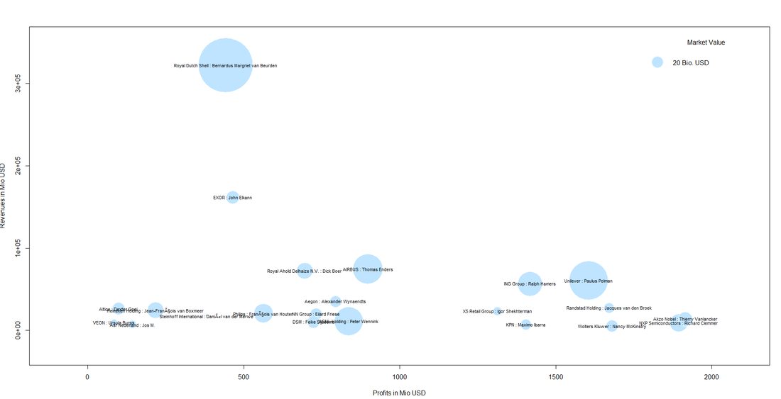
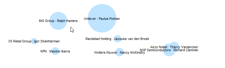
| We see that the largest firm in Holland revenue-wise is Royal Dutch Shell with its CEO Bernardus Cornelis Margriet van Beurden - or just "Ben" van Beurden. Not only Shell´s revenue of some 320 billion US dollars is impressive but also its market value of some 300 billion that makes it the largest bubble in the plot. |  |
We can also spot a cluster of companies with high profit volumes in the lower right of the bubble chart. This cluster contains "big names" like Unilver but also contains firms that are not as widely known:
Even though it might not be so easy to meet some of the CEOs immediately, it might be worthwhile researching whether those big and powerful corporations have CSR departments, foundations etc. one can get in touch with.
This was it for this month´s post. We hope you stay "open" over the summer break not only towards data but also our blog :-).
This was it for this month´s post. We hope you stay "open" over the summer break not only towards data but also our blog :-).


I have to be honest at this time of the year. Now that most European football leagues are about to close as they have found their winners and Champions League final is close, I must admit that summer will be empty somehow as I am a football fan. Being realistic at the same time, it is hard to think too idealistically about football clubs, players and their fans. Football has become a billion-euro business. Renowned clubs nowadays have to think in terms of a globalized market. Regardless of that, I still have the impression that football is still frequently associated with concepts like intuition (of coaches and players) and talent (particularly in the case of players). Well, I have the impression that there is still a lot of it in the game. Both are definitely unmeasurable and will keep the sport as fascinating as it is. However, a revolution that has taken place over the last years that should not be overlooked. This revolution is about using data.
The American author Michael Lewis wrote the book Moneyball that told the story of Billy Beane, the general manager of the mediocre baseball team Oakland A’s. The team started using rigorous statistical performance measures to evaluate players which gave them a competitive edge also against the richer clubs in the National Baseball League. For the ones interested in the story, the movie Moneyball from 2011 starring Brad Pitt can be recommended.
Data Science has arrived in modern football. Manchester City for example employs 11 data scientists according to a Guardian article from 2014. Liverpool FC introduced the position Director of Research some years ago, it is currently held by a theoretical physicist who earned his PhD at Cambridge university. Also, training has been “datafied” at many clubs such as TSG Hoffenheim who secured a fourth-place finish in German Bundesliga this season and will therefore play qualifying matches for the Champions League. The amount of data collected (often through wearable devices) and analysed in real-time is huge. It is some seven million data points that are derived from a 10-minute session with 10 players and three balls. The data is accessible in real time and often used in player feedback to help them work on their weaknesses. TSG Hoffenheim closely works with Software giant SAP which is not a really big surprise as the company is the club’s main sponsor.
What is surprising that data and football – particularly in Britain – have a rather long history together. It was in 1950 when Charles Reep, a veteran from World War II and trained accountant got so frustrated with one performance of his club Swindon Town that he started collecting data about the match in the second half. He concluded from the data that it would be reasonable to move the ball toward the goal with as few passes as possible to increase the chance to score more often and thereby win the match. Reeps ideas had strong influence in British football and coined what was long known as British “kick and rush” way to play the game. Today methods are more advanced and the amount of possible data to be analysed is immense. However, the underlying ideas and aims of number crunching in the context of football have not changed a lot. Take a look at this paper published in connection with this year’s Sports Analytics Conference hosted by the MIT Sloan School of Management. That´s counting a lot of passes from a lot of players in a highly advanced manner!
If you are a data scientist interested in football and want to play around a bit (maybe in the football-free-zone over summer), you might wish to get inspired by guys like Martin Eastwood and his talk Predicting football using r. Everything you need to re-do the example can be found in this Git Hub repository. Martin also has a blog on football analytics that is worth reading, it is called Pena.lt/y. If you want to dive deeper (what a wordplay in a football-related blog post 😊) there is for instance a whole Sport Analytics package in R which is a selection of data sets, functions to fetch sports data, examples, and demos. Not to mention the countless possibilities of web scraping in R towards online football databases.
So, let’s keep the ball rolling. I wish you a nice start into the summer.
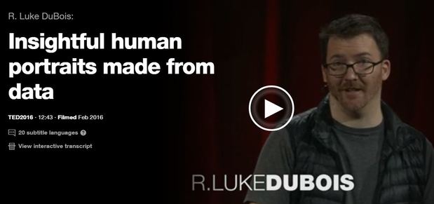
Artist R. Luke DuBois transforms data into artworks. In his talk DuBois shares nine very different projects from American presidents to Britney Spears. He also reflects critically on the way we use data in our culture. Just click the picture above to see the artist in action. By the way it is worthwhile to check out his website that contains other projects: lukedubois.com/

Media confront us with bad news every day. In the face of political uncertainties and extremism, climate change, growing inequalities etc. it sometimes seems hard not to see the world as a rather hopeless place. However, we must not forget that - with regard to many aspects of human life such as health, education, life expectancy etc. - we actually live in the best world and time since the beginning of mankind. The good news is: There are tons of data that support this view of the world! There are some guys and pages I can really recommend in this context.
If you are on TED and watch talks there, then you might know Hans Rosling as an inspiring and humorous speaker. Hans is one of the founders of the Gapminder Foundation (www.gapminder.org/). The foundation's page offers great data visualization tools and contains a large number of datasets that can be downloaded for free.
Oxford economist Max Roser (www.maxroser.com/), by the way an alumnus of Innsbruck University like myself, is the mastermind behind the platform Our World in Data (https://ourworldindata.org/) which also offers a lot of material and functionalities that can be used to develop and sustain a fact-based world view.