|
In last month's blogpost, we referred to the impactful Economist article stating that data is the new oil. One interpretation of this metaphor is that data can be seen as "fuel" for today's economy. This also applies to the nonprofit sector. The reference to oil does, however, not necessarily mean "digging for data" implies high costs in terms of acquiring and collecting it. There is quite some open data around which might be useful in a fundraising context. We see a broad range of possible use cases when it comes to open data in a fundraising context:
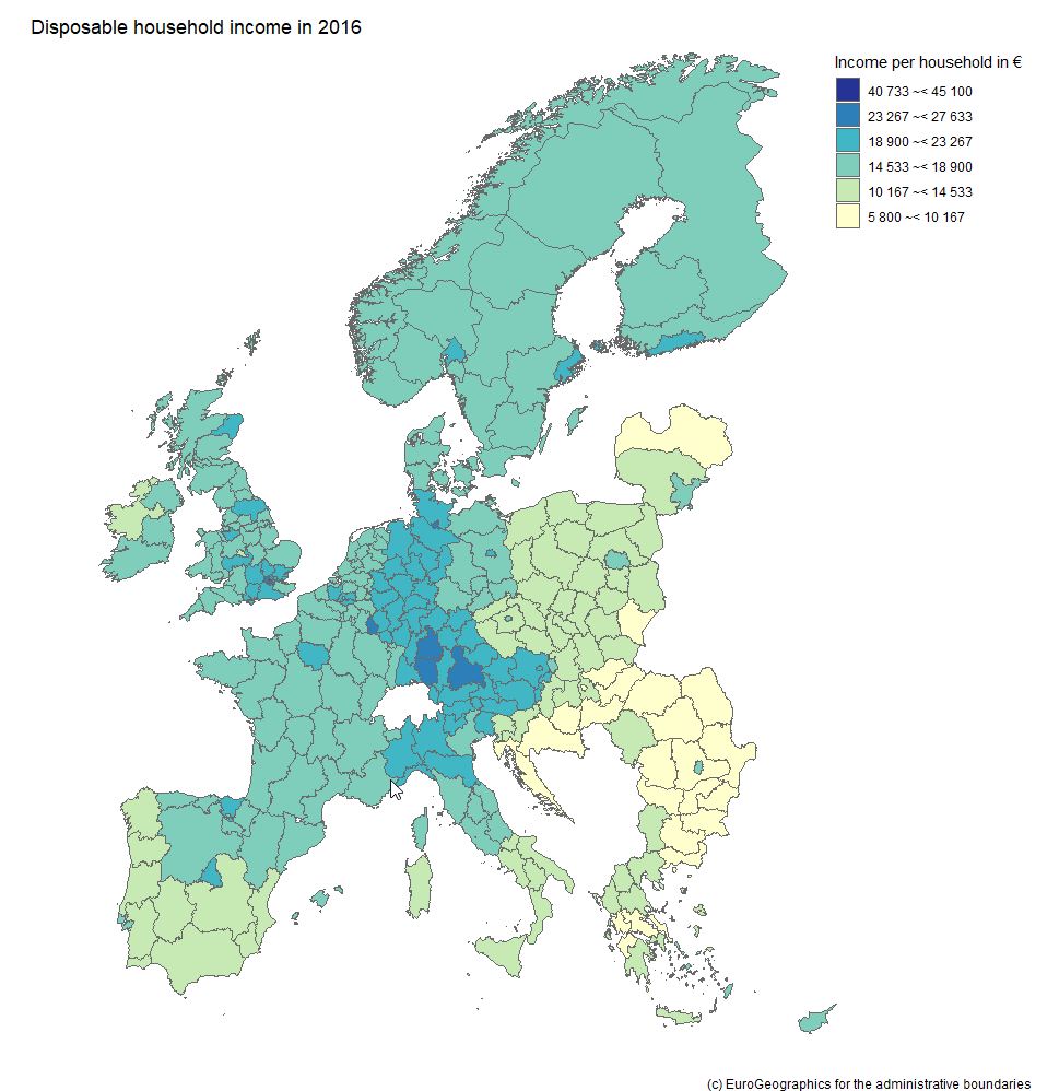
We will rush trough two hands-on examples to illistrate how to obtain, process and visualize open data with possible value for fundraising decision makers and analysts. Example 1: Visualizing income data on regional level Geographical disparities can be of relevance in the context of certain fundraising practices such as events or contact to High Net Worth Individuals (HNWI). Some regions are "wealthier" than others in terms of the respective average income levels. This information allows some conclusions about overall fundraising potential in a respective area. An aggregation level that we find useful and a good "common denominator" are the so-called NUTS regions the European Union uses. NUTS sounds like an English acronym, however, it is a French abbreviation and for Nomenclature des unités territoriales statistiques, in other words regional stat units. The European Union´s Statistics Office is called Eurostat. They offer a huge database that can be accessed online and is free of charge in most cases. We download not only data on the regional distribution on the level of NUTS2 areas but also use the specific R package eurostat. NUTS2 areas are quite "intuitive" in our eyes. In Austria, for instance, they reflect the federal provinces whereas Germany with its 16 provinces is split into 38 regions. For reasons of completeness, we show you how we searched for respective income data in the code snippet below. Our code is by the way inspired by this recommendable tutorial on eurostat. Code Snippet 1.1: Load libraries and search for data
The query above shows us 3 tables that contain income data. We decided to use the table with the index tgs00026, it contains data on disposable household income on regional level. Code Snippet 1.2: Obtain both income and geospatial data
We now have two dataframes, one for the income data with a regional variable and one for the actual geospatial data. We merge the two and dive into the visualization immediately: Code Snippet 1.3: Merge datasets into one and visualize data
As we already used a little French today, we are now able already to say voilà as the overview visualization we were striving for is finised and presentable: Example 2: What about large companies and their CEOs? The name Forbes might ring a bell if you think of listing the wealthiest people on the planet. Forbes also publishes data on the largest companies on an annual basis. We signed up at the platform data world - which we can also recommend - and obtained the 2018 dataset for the 2.000 largest corporations (here - signup is necessary). Luckily this data contains country information and also names the respective CEO - but step by step. As we are working with a flatfile, we did some data prep in it before loading it into R; we end up with a dataset that contains the following variables:
Code Snippet 2.1.: Read the file and select one country
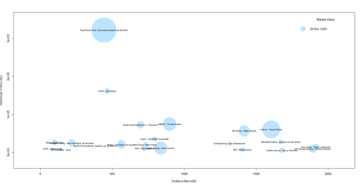
So far, so good. We now have a condensed dataframe in R that contains the Dutch corporations that are listed in the Forbes 2000, i.e. 22 firms. We prepare a bubble chart with the company revenues and profits on the axes. The market value (mostly in shares) shall be reflected by the acutal size of the bubble. Code Snippet 2.2.: Draw the bubble chart
This is our result:
We can also spot a cluster of companies with high profit volumes in the lower right of the bubble chart. This cluster contains "big names" like Unilver but also contains firms that are not as widely known: Even though it might not be so easy to meet some of the CEOs immediately, it might be worthwhile researching whether those big and powerful corporations have CSR departments, foundations etc. one can get in touch with.
This was it for this month´s post. We hope you stay "open" over the summer break not only towards data but also our blog :-).
0 Comments
 Landscape sculpture called "Dear Leader" created by Edward Tufte Landscape sculpture called "Dear Leader" created by Edward Tufte Visualizing data is an integral part of analysts´ and data scientist’s day-to-day life. Visualizations are not produced for the sake of beauty and design – at least not exclusively. One could say the common denominator for data visualization is to make it easier to process information for the human brain and therefore for the recipients. This might lead to better decision making (this is what is often called actionable insights), meaningful storytelling (e.g. in the area of data journalism in general but maybe also particularly in the context of NPOs) and the increase of so-called data literacy. One may like it or not but we live in a highly quantified society which means that often also "non-quantitative“ professionals across industries are required to consider data. The final product that analysts are asked for by recipients are often charts and infographics. Visualizations also play an important role in the course of data science projects. In line with CRISP DM thinking, it is often data visualizations that help develop the so-called data understanding. Modern tools such as good old Excel or more integrated and holisitc solutions like Power BI make it possible to process large amounts of data from different sources with relative ease and in short time. We can therefore draw a preliminary conclusion: The need for visualization of data will persist and steadily grow, modern tools make life significantly easier in this regard. But what does it actually mean do come up with good data visualizations?  The good news is: There are various sources and thinkers one can turn to get inspirations and recommendations in the context of data visualization and information design. In this month’s blog post, we will take a close look at the work of Edward Tufte. Tufte is an American statistician and professor emeritus of political science, statistics, and computer science at Yale University. He is one of the most influential contemporary thinkers in the field of information design and data visualization. The New York Times went as far as to call him the “Da Vinci of Data” in 1998. More than 35 year ago, Tufte published the first edition of The Visual Display of Quantitative Information which has become a classic on statistical graphics, charts, tables. Tufte is also known for some easy to remember quotes such as: "If the statistics are boring, then you've got the wrong numbers." Tufte has coined the idea of Graphical Excellence. Graphical Excellence means the efficient communication of complex quantitative ideas towards recipients. This requires clarity, precision and efficiency. What does efficiency mean in this context? The viewer should be given the greatest number of ideas in the shortest time with the least ink in the smallest space. You could say this is the application of a minimalist and “less is more” philosophy in the context of data visualization. Graphical excellence is the well-designed presentation of interesting data - a matter of underlying data, of statistics and of design. One could say in data visualization, data is not everything but without the appropriate data, everything is nothing. Data and the messages derived from it have to be correct. Tufte uses the term integrity in this regard. There is a plethora of sources on how to lie with statistics. Data has to be relevant for the respective viewer. As mentioned above, Tufte went as far as to say that if the statistics are perceived as boring, then you've got the wrong numbers. When it comes to design, Tufte suggests the following things that graphics should do:
"Design cannot rescue failed content!" ... is another striking quote by Tufte. We tried to put togehter an interesting (hopefully!) slideshow with some "evergreen" data visualizations and inspiring works from the recent past. Have a look, enjoy and read you next time!
We have discussed various topics from the area of data science and analytics on our blog in the past months. Data visualization was focused on quite frequently (as we find it inspiring and fun ?). We for instance talked about the power of data visualization in our last blog post. We also mentioned Power BI, a state-of-the-art tool for data integration, analytics and visualization there. Power BI was released by Microsoft some years ago and is comparable to other well-know tools from the field like Tableau and Qlik.
On askyourdata.co, we constantly try to discuss possible applications of data science and analytics in the context of fundraising. Today’s communication mix and fundraising cannot be imagined without the use of digital channels such as display advertising, Search Engine Marketing (SEM) and Optimization (SEO), social media as well as good old websites and blogs, to name just a few. Those “newer” channels (compared to more traditional ones such as direct mailing) bring new analytical and visualization possibilities about. We therefore decided to bring it all together and present a Power BI visualization showcase in this month’s blog post. Which data would have been more suitable for that than the one from our blog askyourdata.co? So, voilà - our little showcase can be found below - we invite you to have a closer look! You can either use the navigation page or use arrows in the footer to browse the pages. The second page contains some hints on how to use the visualizations interactively. We embedded the showcase as iframe below, you can also access the original version using this link. We have Google Analytics implemented on this site – which just requires some lines of additional HTML code. Google Analytics is one of the various services Google offers, it is for web analytics and allows tracking and reporting website traffic. Power BI allows accessing Google Analytics accounts trough its API. Google Analytics and add-on products such as Google Data Studio include data visualization features themselves. However, Power BI brings even broader possibilities and allows the integration of various data sources such as data from SQL servers (which many CRM systems and BI solutions are based upon) or tools like Adobe Analytics. It starts getting really interesting for analysts when data from the actual digital fundraising channels and CRM data that reflects supporter care and behaviour (typically from CRM or BI systems) are looked at in an integrated manner. This is a topic we plan to take discuss in-depth in one of our upcoming blog posts. We used sessions to measure the traffic on this site. Amongst a general overview for sessions over time, we looked at where traffic has been coming from in terms of channels and locations. We were also interested in the devices (desktop, mobiles, tables) our readers use to visit askyourdata.co. Although our showcase is a simplified example, we think it gives an idea of the possibilities that modern visualization tools imply for both data from digital and "classic" channels. As always, we appreciate your comments and feedback - and look forward to welcoming you again on our blog. We wish you a pleasant start into hopefully nice summer. About a year ago, we promised to dedicate a significant share of the content on this blog to data visualization. Let´s look back together how we did – and add up :-)! In January 2017, we claimed that data visualization has the potential to help us see and convey concepts and facts in a graspable and interesting way. Data that are appropriately visualized might be easier to understand and process for recipients. This in turn might contribute to better decision making in different types of organizations. At the same time, data visualization can essentially be seen as a mean of storytelling which might be driven by an underlying agenda such as catalyzing social change or raising awareness for certain topics. History of data visualization started long before the computer age – some might even see the paintings on the walls of Lascaux as the first data visualizations. In April 2017, we dived a little deeper and took a closer look at what good data visualization would actually be about and recommended some potential sources of inspiration. A highly influential thinker we can recommend in this context is Edward Tufte, an American statistician and professor emeritus of political science, statistics, and computer science at Yale University. Tufte coined the concept of graphical excellence: "Graphical excellence is that which gives to the viewer the greatest number of ideas in the shortest time with the least ink in the smallest space." This implies an attractive display of statistical information; these visualizations:
A recommendable read is Tufte's book The Visual Display of Quantitative Information. One form of data visualization we are fond of are maps – so we dedicated a blog post to it in August 2017. For visualization aficionados, the fun begins as soon as less common and to a certain extent special charts come into play. In September 2017 we took a closer look at Sankey and Chord diagrams. In our view, it is still the sound concept and user-oriented design of data visualizations that essentially make a difference. However, there are powerful tools around nowadays. What they have in common is the fact that they are on the one hand capable of integrating various different data sources and on the other hand offer various functionalities in terms of visualization, navigation and interactivity. Our latest video which you can find on the joint systems Youtube channel takes an exemplary look at Power BI from Microsoft. We will keep on visualizing and reflecting on it. Anyway, we wish you relaxing Easter holidays and a nice spring. See / hear / read you soon!
Today I want to introduce 3 different kinds of charts and how they can be applied to data on donor segments and income. You might have come across these kinds of visualizations before - but maybe in different contexts such as the illustration of voter streams after elections or the visualization of genome data. All charts were generated with the software R which is an open source statistical software. I would go as far as to term it ecosystem as there is a vast amount of additional packages and a large community is constantly developing the features of R. The following charts are all interactive html visualization, so please click on the respective pictures below to open them and take a closer look. 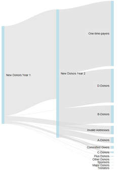 Sankey Diagram Sankey Diagram The first visualization is a so called Sankey Diagram. I have seen them called River Plot as well. Sankey Diagrams are special forms of flow charts. They are named after an Irish captain who first used them in the late 19th century to show the energy efficiency of steam engines. Comparable visualizations are typically used to illustrate detailed election results when it comes to the (calculated) streams of voters from one party to another. If you are a regular reader of this blog, you might have seen a very famous Sankey Diagram by Charles Joseph Minard that illustrates Napoleon Bonaparte's Russia campaign from 1812. The R code used is relatively simple and incorporates the GoogleVis package. An example can be found here (scroll towards the end of the page). The example to the left attempts to visualize the migration of donors from defined segements over time, The thickness of the line represents the number of donors having moved from one group to another. The interactive version of the chart (click the picture) gives you a tooltip showing the exact numbers.  Chord Diagram Chord Diagram The visualization to the right is a so called Chord Diagram. Wikipedia defines Chord Diagrams as a graphical method of displaying the inter-relationships between data in a matrix. Chord Diagrams are quite frequently used to visualize genome data, the New York Times published a beautiful example back in 2007. There are several ways to generate Chord Diagrams in R, I used the tool by Matt Flor that can be found on GitHub. The idea behind the sample data I used is again leant against the migration of donors from segments from year 1 to segments in year 2 within a defined segmentation model. 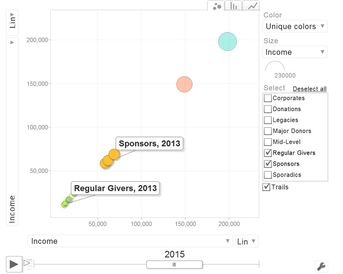 Motion Chart Motion Chart The third chart makes your data move - it is a so called Motion Chart. I used sample data in a flat file containing income per donor segment (or "business area") per year from 2013 to 2016. Again, with some simple lines of code in R using the GoogleVis package, data can be visualized and animated in a bubble chart (with several different options) as well as in more "classical" bar and line charts. It is worth mentioning that no actual data is transmitted to Google when using the API, the actual rendering happens in the browser. The examples I created worked fine in Internet Explorer 11 and Edge under Windows 10. If you are interested in the R code / sample data I used or a chat, please feel encouraged to get back to me via this site, email of social media. I hope you have / had a nice end of summer. See you next month :-)!
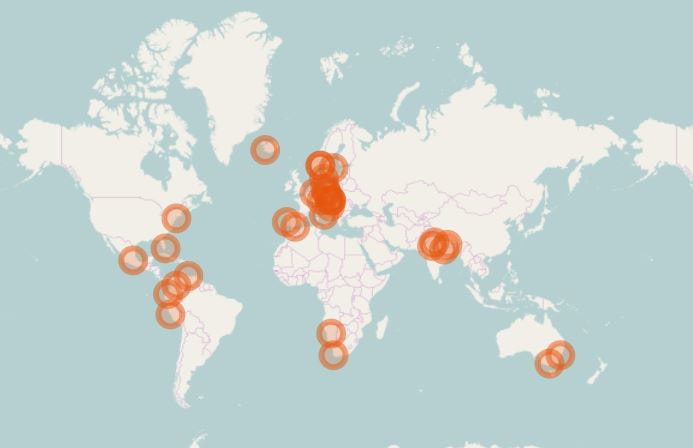
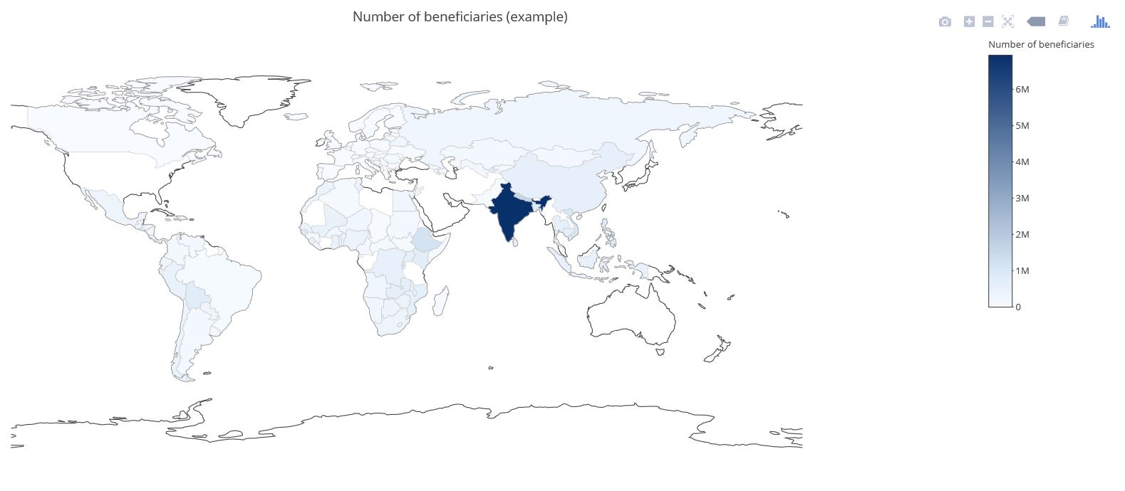
Visualizing data in maps can be a bit of a challenge although widespread tools like MS Excel recently got improved functionalities in this context (see for example our blog post called Where the donors are from earlier this year). There are two R packages that are definitely worth taking a look at when it comes to producing maps with data. The first one is called Leaflet. Leaflet is an open-source JavaScript library for creating and customizing interactive maps. These maps can be used directly from the R console, within R Studio as well as in in so called Shiny Apps and R Markdown documents. Leaflet is becoming more and more popular, probably also because of its use in online media (see these examples from the NY Times and the Washington Post). Using Leaflet is fairly easy. A very simple example shows some of the major cities I have visited on a world map and attaches a little comment popup to them. The data underneath is straightforward (longitudes, latitudes, comment) and the code is quite self-explaining. Click on the Image below to see the interactive result: Another recommendable package is Plotly (also spelt Plot.ly like its URL). Plotly is a virtual data analytics and visualization tool. The platform as such invites to play around. Plotly contains libraries for languages like Python, Perl and MATLAB and last not least a package for R. I have created a simple example with made-up data on the number of potential beneficiaries per country on a world map. This is the result (click image below): There are sources with way more impressing showcases than mine, e.g in the R Graph Gallery. Three examples I found inspiring in a broader fundraising and charity context are maps with illustrations of Nepal earthquakes as well as a London income map.
The possibilities with Leaflet and Plotly seem limitless. I have made the experience that working with the two – after some initial tweaking with the data and getting used – is really fun! |
Categories
All
Archive
June 2024
|
