 A good sketch is better than a long speech. Napoleon Bonaparte The idea behind the good old proverb about the picture being worth more than a thousand words might be way older than the actual idiom or Napoleon’s quote.
The world has become highly dynamic and connected. This turns the communication of complex topics and interdependencies into a real challenge. Times that brought us (in my eyes terrifying) terms like „alternative facts“ make it more important than ever to convey information in a form that enables and catalyzes reflection, discussion and eventually change. Data visualization can help us to see concepts and facts in a graspable and interesting way, be it about climate change or refugee migrations across the Mediterrenean Sea. Apart from this "educational" function, visualization are often just fascinating as well as beautiful and moving. I will frequently blog about this topic and can, for instance, highly recommend David McCandless site called Information is beautiful.
2 Comments
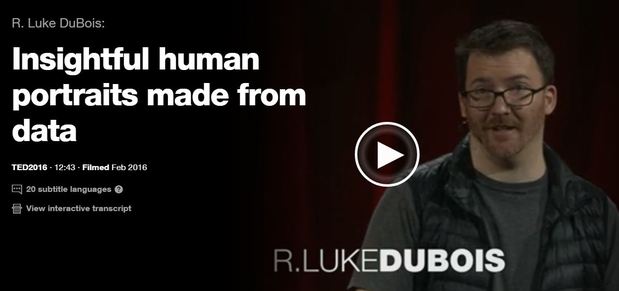
 Artist R. Luke DuBois transforms data into artworks. In his talk DuBois shares nine very different projects from American presidents to Britney Spears. He also reflects critically on the way we use data in our culture. Just click the picture above to see the artist in action. By the way it is worthwhile to check out his website that contains other projects: lukedubois.com/  Media confront us with bad news every day. In the face of political uncertainties and extremism, climate change, growing inequalities etc. it sometimes seems hard not to see the world as a rather hopeless place. However, we must not forget that - with regard to many aspects of human life such as health, education, life expectancy etc. - we actually live in the best world and time since the beginning of mankind. The good news is: There are tons of data that support this view of the world! There are some guys and pages I can really recommend in this context. If you are on TED and watch talks there, then you might know Hans Rosling as an inspiring and humorous speaker. Hans is one of the founders of the Gapminder Foundation (www.gapminder.org/). The foundation's page offers great data visualization tools and contains a large number of datasets that can be downloaded for free. Oxford economist Max Roser (www.maxroser.com/), by the way an alumnus of Innsbruck University like myself, is the mastermind behind the platform Our World in Data (https://ourworldindata.org/) which also offers a lot of material and functionalities that can be used to develop and sustain a fact-based world view. |
Categories
All
Archive
June 2024
|