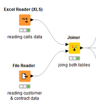
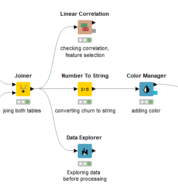
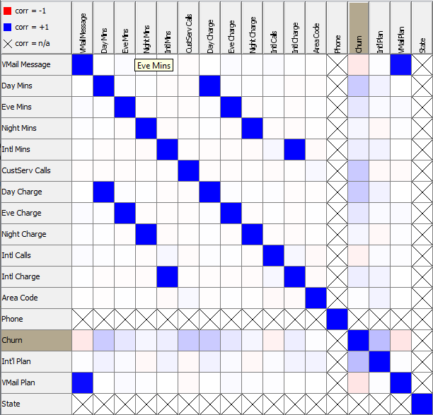
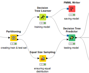
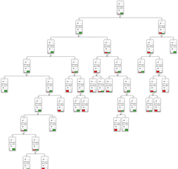
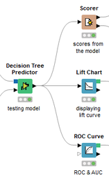
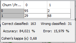
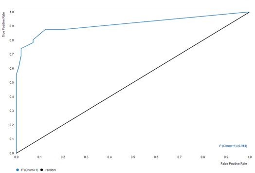
 David Weber, BA Data Science & Analytics “If your only tool is a hammer, then every problem looks like a nail.” – Unknown. Today’s data science landscape is a great example where we need hammers, but we also need screwdrivers, wrenches and pliers. Even though R and Python are the most used programming languages for data science, it is important to expand the toolset with other great utensils. Today’s blog post will introduce a tool, which lets you leverage the benefits of data science without being native in coding: KNIME Analytics Platform. KNIME (Konstanz Information Miner) provides a workflow-based analytics platform that enables you to fully focus on your domain knowledge such as fundraising processes. The intuitive and automatable environment enables guided analytics without knowing how to code. This blog provides you a hands-on demonstration of the key-concepts. Important KNIME TermsBefore we start with a walkthrough of a relevant example, we need to declare some of the most important KNIME terms. Nodes: A node represents a processing point for a certain action. There are many nodes for different tasks, for example reading a CSV-file. You can find further explanations about different nodes on Node Pit. Workflow: A workflow within KNIME is a set of nodes or a sequence of actions you take to accomplish your particular task. Workflows can easily be saved and used by other colleagues. Even collapsing workflows into a single meta-node is possible. That makes them reusable in other workflows. Extensions: KNIME Extensions are an easy and flexible way to extend the platform’s functionalities by providing nodes for certain tasks (connecting to databases, processing data, API requests, etc.). Sample Dataset and Data ImportFor demonstration, we are going to use a telecom dataset for churn prediction. This dataset could be easily replaced with a fundraising dataset containing information about churned donors. Customer or donor churn, also known as customer attrition is a critical metric for every business, especially in the non-profit sector (i.e. quitting regular donations). For more information on donor churn, visit our previous blog posts. Consisting of two tables, the dataset includes call-data from customers and a table about customer contract data. While using some of the information available, we will try to predict whether a customer will quit his subscription or not. Churn is represented with a binary variable (0 = no churn, 1 = churn). For visualization purposes, we are going to use a decision tree classifier, although there are probably even better classification algorithms available. First, we are using an Excel Reader and a File Reader to import both files. To make things easier, we use a Joiner node where we join both tables based on a common key. The result is a single table now ready for exploration and further analysis. Feature EngineeringFeature Engineering is the process of analyzing your data and deciding which parameters have an impact on the label we want to predict – in this case whether a customer will quit or not. In other words: Making your data insightful. But before we look at correlations between the label and the features, a general exploration of our data is recommendable. The Data Explorer node is perfect for some basic information. One thing we notice is that we need to convert our churn label to a string, in order to make it interpretable for our classifier later. This can be done with the Number to String node. Now it’s time for some correlation matrices. We are able to see some correlation between various features and our churn label, whereas others do not correlate really. We decide to get rid of those. Model TrainingNow let’s start with the training of our model. But before we can do that, we need to partition our data into a training- and test-dataset. The training-set (mostly around 60-80% of our data) is used to train our model. The other part of our data will be used to test our model and to make sure it has prediction power. We can verify this with certain metrics. In this case, we will set the partition-percentage to 80%, which seems to be a good amount. This data will be fed into our decision tree learner. After some computing time, our finished decision tree looks like this: In order to make the model reusable and available for predictions with new datasets, we can save it with the PMML Writer node for later use. PMML is a format for sharing and reusing built models. If we want to, we can read the model later on with a PMML Reader node to make predictions with a new, unknown dataset. But before we use our model on a regular basis, we need to evaluate it with our test-dataset, which we split earlier. Model Prediction and EvaluationNow, testing our new model and evaluating its performance is one of the most important steps. If we can’t be sure that our model will predict right to a certain extent, it would be fatal to deploy it. So we feed the Decision Tree Predictor node with our test-dataset. This lets us see how the model performed. We have certain metrics within our KNIME workflow to fully evaluate it. First, we are using a Scorer node to get the confusion matrix and some other important statistics. Our confusion matrix gives us a little hint about threshold tuning, but the accuracy with 84% looks already pretty good. Our model predicted 29 cases as ‘no churn’, although they were actually ‘churning’. This number is rather high, so we should consider tuning our model parameter. Next up is the ROC (Receiver Operating Characteristics) Curve. It maps True Positive Rates and False Positive Rates against each other. One of the results is the AUC (Area under the Curve) which adds up to a very good score of 0.914. A score of 0.5 (the diagonal in the chart below) represents prediction without any meaningfulness, because it means predicting randomly. Additional metrics would be the Lift Chart and Lift Table, but an explanation would be beyond the scope of today’s blog. We think it’s time to summarize and draw a conclusion. Too good to be true?KNIME is a powerful platform, which provides various possibilities to extract, transform, load and analyze your data. However, simplicity has its limitations. In direct comparison with various R packages, visualizations are not as neat and configurable. And the ‘simplistic’ approach to data science limits possibilities in some way or another, requiring the user to have a thorough understanding of the data science pipeline and process. Further, most real life cases are more complicated and need more feature engineering and analysis beforehand – creating the model itself is mostly one of the smallest challenges.
Nevertheless, we think that KNIME is an awesome tool for data engineering / exploration and workflow automation (and building fun stuff with social media and web scraping). But if you are looking for complex models supporting your business decisions – KNIME won’t probably be the platform you are searching for. We hope you liked this month’s blog post and we would love to get in touch if you are interested in achieving advanced insights with your data or just want to dive deeper into the topic. If you want to know what Joint Systems can offer you concerning data analytics, this page will provide you with more information.
2 Comments
|
Categories
All
Archive
June 2024
|
