Ask your data
  • Blog
  • About & Contact

Diving into churn modelling

4/25/2017

2 Comments

 
Bild
Many organizations in the profit as well as the nonprofit sector have developed strategies to prevent and minimize the churn (loss) of their customers or donors. These strategies have to go along with the development and application of quantitative metrics that allow measuring churn in order to keep track of how many customers or supporters have gone away over time. How the “gone away” is defined is specific to the respective organizations and the products / services they offer. Churn analyses have a quite long tradition in the telecom sector where different kinds of contracts are offered on the one hand and barriers for customers to leave company A for company B are relatively low on the other hand.

The practise-oriented R case study that is mentioned towards the end of this post was also taken from a telecom example.

At first glance, coming up with a churn rate is fairly easy and simple maths only. Measure the numbers of distinct customers / donors (or contracts or committed gifts) lost in a defined period (say, a month) and divide it by the number of customers / donors / contracts etc. at the beginning of this period. This is straightforward, simple in its application and can be easily
explained – and is therefore a logical first step to tackle churn from an analytical standpoint. An interesting blog post from ecommerce platform provider Shopify offers a discussion on different aspects of churn calculation – and why things are not always as straightforward as they might seem at first glance. 

With regard to an inferential or predictive approach to churn, the blog KD Nuggets summarizes possible approaches and names two major streams:
  • Machine learning methods (particularly classifications)
  • Survival analyses (e.g. using survival and hazard functions that measure drop-out from a population)

KD Nuggets recommend not to focus too much on one modelling approach but to compare the (particularly predictive) performance of different models. Last, not least they recommend not to forget sound and in-depth explorative analyses as a first step.

Will Kurt wrote a highly recommendable, relatively easy to read (caveat: Still take your time to digest it ...) blog post on how to approach churn using a stochastic model of customer population. Have a particular look at the Takeaway and Conclusion part. A summary attempt in one sentence: Although churn is random by its very nature (Brownian motion), suitable modelling will help you (based upon existing data) tell where your customer population will end up in the best and wort case (see picture below - 4.000 customer just will not be reached if we keep on going as we do now ...)
Bild
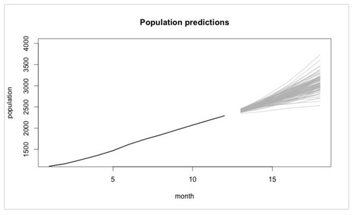
​Last, not least, if you are interested in a case study from the telecom sector where a Logistic Regression Model was implemented with R, go and have a look at this blog post. The respective R code is also available at Github for the ones interested.

So – enjoy spring if you can and please don´t churn from this blog 😊.

2 Comments

What makes good data visualizations?

4/3/2017

0 Comments

 
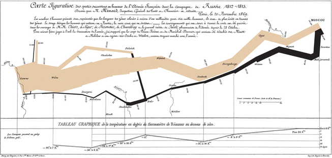
Browsing through the web or attending conferences in the area of IT and marketing, one might get the impression that data science is ubiquitous. If somebody starts researching what data scientists actually do, they mostly come across terms like predictive modelling, machine learning and data mining. These terms sound sophisticated – and the activities they imply certainly are. However, apart from all modelling, algorithms and fancy tools it should not be overlooked what I think is a core task of a data scientist. They have to help people to understand data and support their decision making. To achieve this, data has to be presented in an understandable, “digestible” and convincing manner. This is where the field of data visualization comes into play which is an essential and indispensable aspect of doing data science.

Data visualization was invented long before the IT revolution – you could actually say it was not so long after the French revolution. Charles Joseph Minard pioneered the graphical illustration of information in the first half of the 19th century. A lot of his work is still inspiring today. In 1869, when he was already retired, Minard produced a chart that many regard as one of the best data visualizations ever made. On the very left, it shows Napoleon Bonaparte’s Grande Armée at the start of the 1812 Russia campaign. The thickness of the line represents the size of the army. In addition to the size of the army, the visualization incorporates the distance travelled by the soldiers, the temperature, direction of travel, latitude and longitude and the relative location. That is tons of information integrated in one beautiful and graspable visualization!
Bild
[Click here to see a version that can be enlarged]

What makes good data visualizations? Yale professor emeritus Edwart Tufte wrote in his book The Visual Display of Quantitative Information that “Graphical excellence is that which gives to the viewer the greatest number of ideas in the shortest time with the least ink in the smallest space.”  So far, so good. But what does that mean? Visualizing data is daily business for data analysts and data scientist. As with many things, it is combination of theoretical knowledge and good practices finally lead to good data visualizations. As far as the tools are concerned on the one hand, a lot depends on your weapons of choice. Regardless of whether you use R (e.g. package ggplot2), Python, STATA or “just” MS Excel (you can do a lot with it), you have to have a sound command of the tools to make things look as you want them to look. On the other hand, dealing with what makes good (and bad) data visualizations from a more theoretical standpoint is worthwhile. I can recommend some reads that I found insightful here:

  • 8 Ways to Turn Good Data into Great Visualizations by Divya Manickam
  • 5 Data Visualization Best Practices by Emily Rugaber
  • If you want to dive deeper into human perception, read 39 studies about human perception in 30 minutes by Kennedy Elliott, a visual Journalist at Washington Post
  • I have already mentioned Information is Beautiful in an earlier blog post. It is definitley worth visiting.
  • For the German-speaking audience I can recommend the work coined by Dr. Rolf Hichert. See the company´s website for resources and background Information.
  • Last, not least, you might wish to follow some of the leading thinkers in the field. Here is a list of data visualization influencers. We got to know Max Roser in the very first post of this blog.

As always, I´d be happy to hear about your opinions, views and good practices. In the meantime I wish you Happy Visualizing! :-)


0 Comments

    Categories

    Alle
    Artificial Intelligence
    Because It´s Fun!
    Churn
    Clustering
    Data Sciene @NPO
    Data Visualization
    Facebook
    Machine Learning
    Maps
    Natural Language Processing
    Neural Nets
    Power BI
    Predictive Analytics
    Social Media
    Time Series
    Twitter

    Archive

    Januar 2021
    November 2020
    September 2020
    August 2020
    Mai 2020
    April 2020
    Februar 2020
    Dezember 2019
    November 2019
    September 2019
    Juni 2019
    April 2019
    März 2019
    Januar 2019
    Dezember 2018
    Oktober 2018
    August 2018
    Juni 2018
    Mai 2018
    März 2018
    Februar 2018
    Dezember 2017
    November 2017
    Oktober 2017
    September 2017
    August 2017
    Juli 2017
    Mai 2017
    April 2017
    März 2017
    Februar 2017
    Januar 2017

About

Copyright © 2018
  • Blog
  • About & Contact