Why should we segment Donor Data? Segmentation is the process of dividing a market of individuals or organizations into subgroups based on common characteristics. This process allows organizations to align their products, services, and communication strategies with the specific needs of different segments. In the case of fundraising, by understanding what drives donor groups and their available choices, organizations can tailor their approaches for more effective engagement. Key Dimensions for Donor Segmentation Donor segmentation can be approached from various dimensions, including psychographic, geographical, behavioral, and demographic factors. Each dimension offers unique insights:
 Of course, not all data necessary for the above-mentioned dimensions is available right away. Some of it is hard to obtain, only indirectly available, or not obtainable at all. In a stylized, way, the possibilites can be summarized as follows:  Behavior-Based Segmentation with RFM One of the most effective methods for behavior-based segmentation is the RFM model, which evaluates donors based on Recency, Frequency, and Monetary value:
Unsupervised Learning for Donor Segmentation In addition, not necessarily as a replacement, unsupervised learning offers a more advanced technique for donor segmentation. Unlike RFM, which relies on predefined categories, unsupervised learning models detect patterns or groups within the data without prior labels. This method is highly flexible and can uncover hidden (sub-)segments that traditional methods might overlook. A simplified "cooking recipe" for a clustering approach like k-means looks as follows:
 Comparing RFM vs. Unsupervised Learning
Both RFM and unsupervised learning have their advantages and limitations:
So What? A straightforward conclusion Unsupervised methods of donor segmentation are designed to incorporate various data types unbiasedly, offering a data-driven approach to understanding donor behavior. While these methods provide valuable insights, they also come with limitations, particularly regarding traceability and group stability over time. Ultimately, a combination of RFM and unsupervised learning techniques can yield the most comprehensive and actionable insights for donor-centered fundraising. Inspired? Interested? In need for a chat? Or are there experiences you can share? Please go ahead and do so and do not hesitate to reach out. All the best and have a great summer!
0 Comments
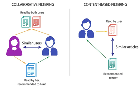
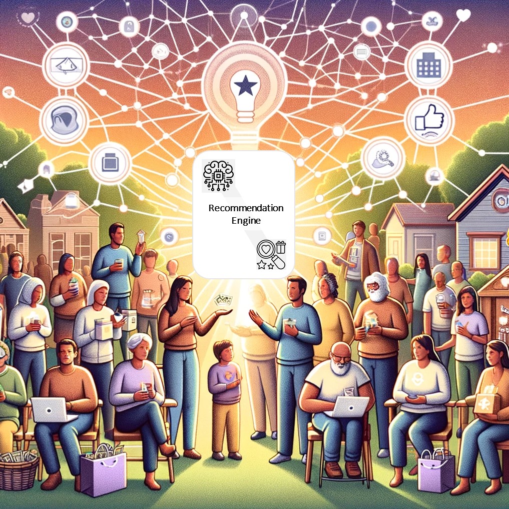 Recommendation Engines in a Nutshell Recommendation engines are advanced data filtering systems that use behavioral data, computer learning and statistical modelling to predict which content, products, or services a customer is likely to consume or engage with. Therefore, recommendation engines are not just giving us a better picture on our users’ interests and preferences; they can also enhance the user experience and engagement. Recommendation engines, like any other data-driven method, need data to be applied. While no specific amount of data is required, data does need to contain high-quality interactions, as well as contextual information about users and items, to be able to create good predictions. Examples of high-quality signals are all kind of data that clearly states the user’s preference, like explicit ratings, reviews or likes to a specific product. While high-quality signals are preferred, implicit signals like browsing history, clicks, time spent reviewing a product or purchase history can also be used – those are more abundant but can be noisy and hard to interpret, since they do not need to indicate a clear preference. In order to extract the relevant information from a dataset, data filter methods are used. Different filtering methods exist, including collaborative filtering, content-based filtering and hybrid filtering methods.
 Why do recommendation engines matter for NGOs? - Possible Use Cases ...
NGOs, like any other organization, are rapidly undergoing digitalization processes. They are increasing their online presence and communication, using online platforms like websites, social media channels or emails, to raise awareness, inform donors about their projects and news, as well as to run online fundraising campaigns. Traditional NGOs also rely heavily on offline communication campaigns like letters, postcards, or even booklets that contain the last news and projects ongoing in the organization. Even though NGOs campaigns may be slightly adapted to different audience groups, we are far from using the donors’ interests in our communication campaigns. Using recommendation engines could help us do data-driven decisions about who to contact, with what content and even what kind of donation to ask for, all based in previous donation behavior. This can potentially improve our fundraising results while keeping donors engaged and supportive towards our projects. Challenges While we know that recommendation engines may help us better address our donors, there are some challenges that we need to take into consideration, like the potential lack of high-quality data and the presence of noise and bias in the datasets.
Conclusion Although some challenges exist (mostly related to the quality and availability of data), we still believe that exploring recommendation engines’ methods and applying them to our data, would help us to better understand our donors’ interests, which ultimately could keep donors engaged and supportive towards our projects. Are you interested in recommendation engines? Do you think that they can help you better understand your donors’ interests? Contact us and let us explore your data together!
In a volatile, uncertain, complex, and ambiguous environment, organizations need to constantly adapt and evolve. This is especially true for fundraising nonprofits, as their sector is increasingly embracing digital transformation. This transformation isn't just about adopting new technologies but reshaping how organizations operate and create value as well as impact for their stakeholders. Digital transformation can be a driving force that propels organizations into the future, enabling them to be more agile, customer-centric, and efficient. To a significant extent, the history of digital transformation was coined by the evoluation of data and its use. The Evolution of Data From the 1950s to the 2000s, businesses relied mainly on descriptive analyses. Reports gave an ex-post view on processes and their results. These were relative „simple“ times, with a focus on internal, structured data from databases and spreadsheets. Around the turn of the century, there was a shift. The 2000s saw the rise of digital data. Innovative, data-driven business models began to emerge. Although there was an ongoing focus on descriptive analyses, the scope widened to include unstructured and external data, for instance from the web and social media platforms. Fast forward to today, and we are witnessing another paradigm shift. Organizations, both from traditional industries and those built on digital business models, are leveraging data-driven decision-making. Predictive and prescriptive analyses aren't just buzzwords but becoming imperatives. It is clear that both structured and unstructured data hold equal relevance, positioning analytics as a core function in any organization. Data is a pivotal resource in Digital Transformation and the sheer volume of data generated today is mind-boggling. However, data essentially is not more than a „raw material“ like oil or wood which need to be cleaned,refined, processed etc. Using data the right data in the right way for the right purposes can be an key success factor for modern organizations. This is where data strategies come into play. Dimensions of a Data Strategy Navigating an ocean of data requires a compass, a robust data strategy. A data strategy can be defined as a comprehensive plan to identify, store, integrate, provision, and govern data within an organization. While a data strategy is often perceived as primarily an “IT exercise”, a modern data strategy should encompass people, processes, and technology, reflecting the interrelated nature of these components in data management. A data strategy is not an end in itself. Ideally, it should align with the overarching strategy of the organization, as well as the fundraising and IT strategies. A closely interlinked area with a data strategy is the analytics strategy. It's crucial to ensure synergy between these strategies for the successful exploitation of data insights and value creation.At least six dimensions of a data strategy can be named.
Crafting a Data Strategy  In a nutshell, the crafting of a data stragey can be achieved following four generic steps.
Four Commandments for your Data Strategy  One should consider at least four recommendations when starting to develop a data strategy.
So what?
According to experts like Bernard Marr, an influential author, speaker, futurist and consultant, organizations that view data as a strategic asset are the ones that will survive and thrive. It does not matter how much data you have, it is whether you use it value-creating and impact-generating way. Without a data strategy, it will be unlikely to get the most out of an organization´s data resources. In case you need a sparring partner or somebody to accompany you on your data strategy journey, please do not hestiate to get in touch with us. All the best and have a great third quarter! Johannes  What is Next Best Action? Who does not sometimes wish for a mentor who always has an appropriate advice? In general, humans are very good at rating known situations and making the right decisions, but in case of new circumstances or a huge amount of aspects to consider, good advice is priceless. In marketing and similarly in fundraising, one-on-one support is very effective, but not possible in most cases. As companies and organizations were growing, mass marketing became the state of the art, trying to sell as many items to as many customers as possible. Customer received overwhelming amounts of advertisement and offers, which can be described as a “content shock”. Since the rise of machine learning and the possibility for sophisticated data analysis, companies try to stand out by putting the customer in the center. This is done by trying to predict what the customer wants and needs. New technologies should advise marketing specialists what to do next in order to satisfy every customer individually – supported by enormous amounts of data. This concept is called Next Best Action (NBA) or Next Best Offer (NBO) and can evolve into a useful fortuneteller in case of effective implementation. The benefits of the concept are reduced advertisement cost and increased customer loyalty. How can NBA systems be developed? The goal, structure and architecture of a NBA system strongly depends on the environment and purpose it is used for. Questions to answer before the development are for example:
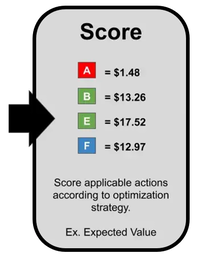
After goals and actions are defined, the general structure of a NBA system can be summarized as follows: 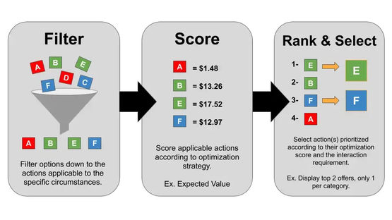 Structure of a NBA system: Actions are presented as letters; colors illustrate different categories of actions. Source: https://databasedmarketing.medium.com/next-best-action-framework-47dca47873a3 The process of step one - filter- is rather rule based, depending on what actions or offers make sense for a customer. For instance, there might be products, which cannot be offered more than one time and therefore their offer will be excluded from the action list after purchase. The same applies for the third step: Typically, the actions with the highest benefit should be chosen but it depends on the user of the system, whether more than one action is taken or the actions need to be filtered again. A reason for a second filtering step could be that only one single action of a certain category is chosen even though two actions from the same category show very high benefit values. As it turns out, most NBA systems are based on proven business rules and requires a well-defined framework before the most complex component – the rating of the actions - can be developed.
A rule-based system requires a lot of experience in the domain and takes time to develop because it is all done by hand: Rule like “rate action xy high if the customer already bought from the category ab in the last two years” can be data driven if they are based on previous findings. Most companies already use such business rules for marketing. The scoring does not need to be metric (with numbers), as shown in the picture below. The system is not adaptive and needs to be adjusted, if the circumstances change. Rule-based systems are characterized by extreme simplification, since the real, very complex interrelationships cannot be completely cast into rules. The needs and the reactions of a customer will change depending on the previous action, which is very difficult to represent in a rule-based way. 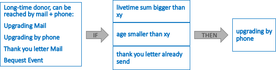 Example for a rule based system. Experience and detailed development is needed to incorporate sufficient rules If a low or intermediate level of machine learning is considered, relatively simple scores and predictions can be incorporated into the system. The simplest approach would be to calculate the probability for all customers to react positively to an action (propensity). To just predict which action might provoke a positive reaction might not be suitable for predicting long term customer loyalty. Several scores and probabilities can be combined to achieve this goal. For example, the propensity can be combined with a prediction of long term customer engagement. The reason for this is that on one hand no action is useful if the customer does not like the action (propensity), but on the other hand the actions also need to have a benefit for the organization (prediction of customer engagement/success for the organization). The scores can be weighted according to their importance and any number of further adjustments can be made. Typically, such a system will still be embedded in several predefined rules. Similar like factors for weighing scores (by multiplication), a higher importance of a score can be expressed by adding meaningful numbers to the score. Disadvantages are that still a lot of experience in the field of use is needed. Scores are required for all actions and they need to indicate the benefit or propensity to the same extent. The system could automatically adjust to a certain extend if the scores themselves are linked to current data and regularly monitored. 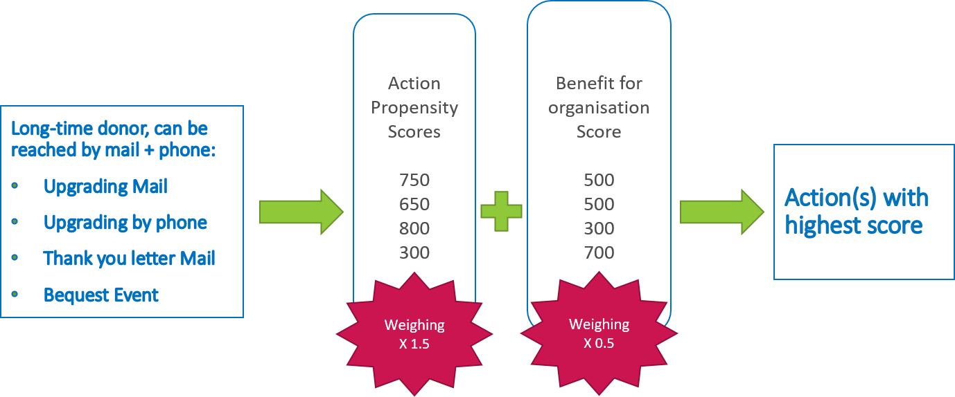 Full Deep Learning Models require more abilities that are technical, experience with deep learning and an appropriate technical environment. The difference to the previous systems is that these models are black box-models without the necessity for the users to tweak and define the rules and scores themselves. While intermediate levels of machine learning require a programmer to intervene to make adjustments, in deep learning the algorithms themselves determine whether their decisions are right or wrong. Internally, the algorithm will calculate scores for each action but will determine the best calculation and weighing itself. Rating systems in this category can range from a deep neural network for predicting benefits of actions to reinforcement learning models, which do not need a lot of training data in advance but can learn implicit mechanisms by trial and error. As long as these systems are fed with current data, they are adaptable. Disadvantages of this approach are the complex development and reduced interpretability due to the fully automated process. 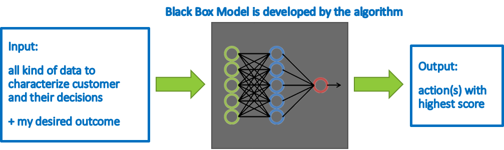 Fully automated deep learning model. So What?
In our view, George Box´ good old quote “All models are wrong, but some are useful” is also worth considering in the context of NBA models. Whether and how these approaches suit the needs of respective (nonprofit) organizations should be evaluated holistically. If you are interested in getting to know more about the concept of NBA or even think about implementing it in your SOS association, please do not hesitate to get in touch with us. Sources https://www.altexsoft.com/blog/next-best-action-marketing-machine-learning https://databasedmarketing.medium.com/next-best-action-framework-47dca47873a3 https://medium.com/ft-product-technology/how-we-calculate-the-next-best-action-for-ft-readers-30e059d94aba https://www.mycustomer.com/marketing/strategy/opinion-five-rules-for-the-next-best-offer-in-marketing
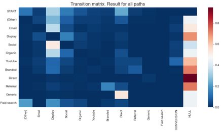
Non-profit organisations (NPOs) use offline-marketing strategies to both attract the attention of potential donors as well as collect donations. With mostly donors from “aging” generations reacting to direct campaigns and because those campaigns are slowly decreasing its impact, NPOs are investing into new ways of collecting donations, including online platforms. Not only online media has the potential to reach a wider profile of users; also, other advantages exist, including traceability, the option to gather user-level data and the fact that customers can potentially be better addressed over online channels. In addition, online media have proven to have a greater effectiveness in terms of customer conversion than traditional advertising. With increasing inflation and life costs and shrinking marketing budgets, it is crucial for NPOs to understand their customer interests and behaviour to better and more effectively address them. If talking about online marketing platforms, this would translate into study what online sources (like email links, YouTube ads or paid search) are the ones bringing more potential donors to our websites. Each person accessing a website to actually buy a product or donate something, may have visited the website before to research about the (donation) product, before finally deciding on converting or making a donation. Obviously, it is interesting to know the influence of each online source in a final donation through a website; this is known as the attribution problem and can be solved by using attribution-modelling techniques. Different attribution-modelling techniques exist, which try to predict the importance of the different marketing channels in the total conversion of customers (or donors). While advertisers tend to use very simplistic, heuristic ones, academia has focused on more complex and data-driven methods, which have been proven to obtain better results. Using data from the visits and donations done during the year 2021 on the website of a SOS organisation, we studied the effect that different marketing channel sources (i.e. "from where do users access a website") had on donations. Analysis were done on Jupyter Notebooks using Python and two different modelling approaches: 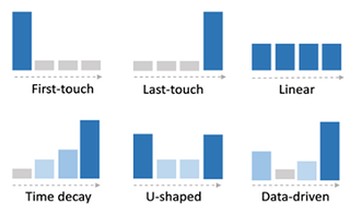
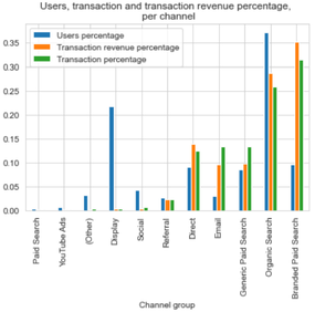 After doing some first data exploration and filtering data representing an “abnormal” visiting behaviour (visits to the career site and those done on #GivingTuesday), we applied both attribution-modelling methods. From our analysis, it could be easily concluded that different online marketing channels do have different effects on donations and donation revenues. However, and to our surprise, minimal differences were found between LTA and MC results for both, estimated number of donations and revenue per channel, probably caused by a “special” behaviour of donors: as it seems, most of them will visit the website just once during the year and decide, on the fly, if they would like to donate something. This overrepresentation of paths with just one touchpoint causes both heuristic and data-driven methods to assign the same (donation) value to the channels. 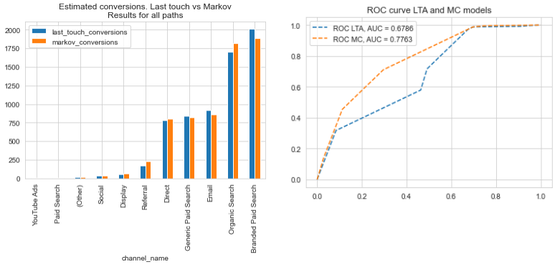 While results are similar, we find that working with data-driven methods as Markov Chains still has advantages, including the fact that:
 Do you want to know more about our results and insights? Are you also interested in a similar study? Do you have online data but are not making use of it?
Get in touch with us! 💻📱📧 We at joint systems can help you get the most out of your data 🙂😉
Some 3.5 years ago we discussed the state of data science in the nonprofit sector in this blog post. The world has significantly changed since then, however, being an insight-driven (nonprofit) organization is more imperative than ever. So, what is actually the status quo of data science and analytics in the nonprofit sector?
The most comprehensive survey on the state of data science and machine learning is the annual Machine Learning and Data Science Survey conducted by the platform Kaggle.com. In 2021, almost 26.000 people took part all across the globe. The participants were also asked about the industry they currently work in, Luckily, survey designers had added "Nonprofit & Services" as an option for the mentioned industry-related question. This enabled us to download the full survey response dataset from the Kaggle website. Using a global filter to focus on the responses from the nonprofit sector, we managed to put together this dashboard: Back in 2019, when we last blogged about the status of data science in the nonprofit sector, we had already started our joint journey with our customers and partners. Still, we are continuous learners. However, together with our clients, we managed to write numerous success stories on how data science and analytics can make fundraising more efficient and successful. If you want to learn more, please go ahead and browse through the free resources we offer on our platform analytical-fundraising4sos.com or watch the video below for some inspiration. We wish you all the best in these turbulent and challenging times. Let´s keep in touch and jointly make the most of fundraising data! Johannes |