Moneyball Released: 2011 Big names: Brad Pitt, Philip Seymour Hoffman IMDB Rating: 76% Plot in a nutshell: The movie is based on the book Moneyball: The Art of Winning an Unfair Game by Michael Lewis. Its main protagonist is Billy Beane who started as General Manager of the baseball club Oakland Athletics in 1997. Beane was confronted with the challenge of building a team with very limited financial resources and introduced predictive modelling and data-driven decision making to assess the performance and potential of players. Beane and his peers were successful and managed to reach the playoffs of the Major Leage Baseball several times in a row. Trailer: Why you should watch this movie: Moneyball highlights the importance of communication skills and persistence for people aiming to drive change using data science. The Imitation Game Released: 2014 Big names: Benedict Cumberbatch, Keira Knightley IMDB Rating: 80% Plot in a nutshell: The Imitation Game is based upon the real-life story of British mathematician Alan Turing who is known as the father of modern computer science and for the test named after him. The film is centered around Turing and his team of code-breakers working hard to decipher the Nazi German military encryption Enigma. To crack the code, Turing creates a primitive computer system that would consider permutations at a much faster speed than any human could. The code breakers at Bletchley Park succeeded and thereby not only helped Allied forces ensure victory over the Wehrmacht but contributed to shorten the horros of the Second World War. Trailer: Why you should watch this movie: It is a (too) late tribute to Alan Turing. Turing was prosecuted for his homosexuality after WWII and eventually committed suicide. The film is also about the power of machines and ethical perspectives in analytics Margin Call Released: 2011 Big names: Paul Bettany, Stanley Tucci, Demi Moore IMDB Rating: 71% Plot in a nutshell: Margin Call plays during the first days of the last global financial crisis in 2008. A junior analyst at a large Wall Street investment bank discovers a major flaw in the risk evaluation model of the bank. The story develops during the night as the young employee informs senior managers that the bank is close to a financial disaster, knowing that the bancruptcy of the firm would lead to a dramatic chain reaction in the market – and millions of lives would be affected. Trailer: Why you should watch this movie: The film depicts to what extent algorithms dominate decision making in the financial industry. It also portrays the interplay between supposedly objective models and human beings driven by emotions and interests. 21 Released: 2008 Big names: Kate Bosworth, Laurence Fishburne IMDB Rating: 68% Plot in a nutshell: Six students of the renowned Massachusetts Institute of Technology (MIT) get trained in card counting and rip off Las Vergas casinos at various blackjack tables. The film is based upon a true story. Trailer: Why you should watch this movie: It is an entertaining and fun movie. In addition to that, it contains some interesting mathematical concepts such as the Fibonacci Series and the Monty Hall Problem. We hope our tipps are valuable for you and you enjoy any of the flicks. 📺🎬 🍿☕🍷
|


In any moment of decision, the best thing you can do is the right thing, the next best thing is the wrong thing, and the worst thing you can do is nothing.
|

|
COVID-19 impacts on fundraising - the case of Face-to-Face
The ongoing crisis caused by the Corona pandemic has brought huge challenges for many people all over the globe and dislocation in all types of industries. The evident impacts and maybe the ones yet to come imply serious threats for numerous fundraising nonprofit organizations. The pandemic has significantly affected the conditions under which widespread fundraising channels can be used. Considering lockdowns all over the world leading to drastically reduced mobility, Corona has most obviously affected Face-to-Face fundraising (F2F). Since the introduction of its contemporary form in the 1990ies (by the way in Austria, where the askyourdata-team is based), F2F has become an enormously important channel for many charities, particularly for the acquisition of regular supporters.
In the majority of countries affected by COVID-19, people were not completely forced to stay inside but allowed to move for certain purposes (work, groceries, walking etc.). One can get an idea of the impact on people´s mobility using the currently publicly available mobile data from Google. You can go ahead and download a flat file to play with on this website. We obtained the global dataset and put together the following dashboard for which we invite you to have a closer look. Just click the two little arrows in the bottom right corner of the dashboard or follow this link.
If you are looking for an insightful situation report on the state of Face-to-Face fundraising in times of Corona from a global perspective, we can recommend the recording of a recent panel discussion hosted by The Resource Alliance. In short, F2F teams all across the world have proved their adaptiveness in many ways already...
What Now?
I cannot tell how many countless times I have recently come across quotes talking about the opportunities that lie in crises. In many cases, they were mere platitudes, at the same time I deeply believe that the world will gradually get closer to how it was before Corona. This will be reflected by people sitting in cafes after some relaxed high-street shopping enjoying the sun ... everything completely mask-free. Will Face-to-Face fundraising be exactly the same then?
Let us try to start dealing with this question with an analogy. COVID seems to have changed almost everything in our lives - but the world keeps turning for the good and the bad. This means, for instance, that Climate Change will not pause just because we are busy with another crisis. The same applies to - in a more positive way - the ongoing digital revoution as well as the expansion of analytics and data science across all types of industries. From my point of view, F2F fundraising has been keeping pace with technological developments quite well in the recent past. The chances to come across F2F agents using tablets, simple and customer-oriented processes, instant messaging services etc. are quite high in many countries. Our hypothesis is, however, that there is scope for even farther innovations ...
The Power of Where: Using Location Intelligence in F2F?
This nice newspaper article illustrates examples of how companies use geolocation data to target their (potential) customers. One of our favourite blogs Towards Data Science has summarised the Power of Where and goes as far as to postulate that location analytics will change the world. Location analytics also has the potential to make contributions during and after this pandemic, as outlined in this recent article by the platform Carto.
Seen from a practical perspective, what might use cases of Location Intelligence be in F2F fundraising? Many mobile network providers across the globe have started offering services in the context of Mobile Location Analytics, as US-provider Verizon calls it. These services are typically not as prominently advertised as other products and tools - but they are there. What might "Mobile Location Analytics" mean? Well, in a retail context, interesting "research questions" might be:
- How mobile users get to brick-and-mortar stores?
- Where do they come from and where do they go subsequently?
- Which locations to they frequently use?
- ...
Seizing this idea, would it not be interesting to know who is moving when across the (high-)street or the shopping center where the next large-scale F2F campaign will take place? Of course, nonprofits following-up the use of such services have to have awareness of data protection and privacy (although this is what the networks have to take care of) and donor communication to be prepared.
Admittedly, we are raising a somewhat ambiguous and maybe even controversial approach as potential add-on to professionalized Face-to-Face fundraising. What is your opinion?
The future is uncertain but this uncertainty is at the very heart of human creativity. |  |
In modern economy, coming up with forecasts as best possible predictions of future income has become an imperative across industries. Also the charitable nonprofit sector has seen an increasing adaption of forecasting methods in recent years. This is why we already dealt with this topic on this blog some time ago. The endeavour of forecasting is challenging enough in times of economic stability but seems almost impossible after the advent of a „black swans“ like the Corona Virus. Of course, the future is just as uncertain as Ilya Prigogine said. At the same time, there is a familiy of statistical models which not only provides "well-informed" income predictions but particularly help in finding out to what extent current data deviates from the "expected normal". Let us therefore take a closer look at fundraising income forecasting using time series.
The basiscs
In their book Financial Management for Nonprofit Organizations from 2018 (by the way a recommendable read), Zietlow et al. differentiate between different forecasting types:
In their book Financial Management for Nonprofit Organizations from 2018 (by the way a recommendable read), Zietlow et al. differentiate between different forecasting types:
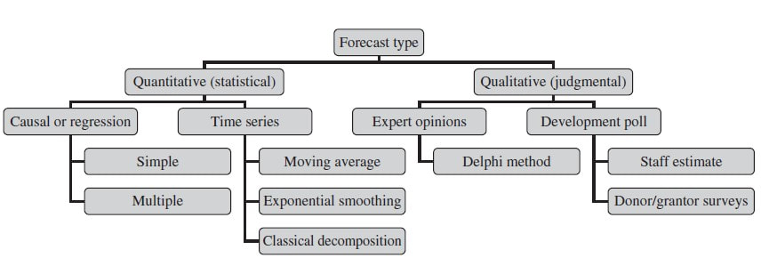
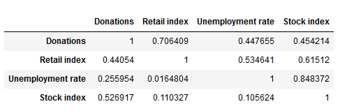
Statistical, forecasting methods can be gernerally divided into causal (also known as regression) methods and time series methods. A causal model is one in which an analyst or data scientist has defined one (simple regression) or several cause factors (multiple regression) for the dependent variable she or he is trying to predict. In the case of income prediction on an aggregated level, drivers (i.e. independent variables) might be found both on the level of donors and exogenous factors.
Time series models work differently and tend to be more complex. They essentially use historical data to come up with predictions on future outcomes. Time series are widely used for so called non-stationary data. A stationary time series is one whose properties are independent from the point on the timeline for which its data is observed. From a statistical standpoint, a time series is stationary if its mean, variance, and autocovariance are time-invariant. The requirement of stationarity (i.e. stability) makes intuitive sense as time series use previous lags of time to model developments and modeling stable series with consistent properties implies lower overall uncertainty.
Time Series in a Nutshell
Time series are often comprised of the following components, although not all time series will necessarily have all or any of them.
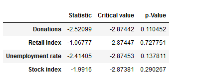
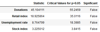
The model we will take a closer look at for the prediction of fundraising income is ARIMA which stands for Auto-Regressive Integrated Moving Average. ARIMA models can be seen as the most generic approach to model time series. Wheter the ARIMA algorithm can be applied to the historic income data right away can be evaluated by statistical methods such as the Dickey-Fuller-Test. The null hypothesis of the Dickey-Fuller-Test assumes that the series is non-stationary. Even if this hypothesis cannot be rejected, which means that the data under scrutiny is non-stationary, there are ways to make time series usable. In this case, differencing and log-transformations of the data can be applied in a preparatory step.
Applied Example
The raw data used for the following example is really straightforward. Historic fundraising income from 2012 to 2019 is extracted in a simple structure (Donor ID, payment date, amount). In a next step, datewise aggregation is applied. Having distinct dates in the dataset allows using both a weekly and monthly perspective on the data. ARIMA is now used to decompose the data. The resulting charts look as follows:
Time series models work differently and tend to be more complex. They essentially use historical data to come up with predictions on future outcomes. Time series are widely used for so called non-stationary data. A stationary time series is one whose properties are independent from the point on the timeline for which its data is observed. From a statistical standpoint, a time series is stationary if its mean, variance, and autocovariance are time-invariant. The requirement of stationarity (i.e. stability) makes intuitive sense as time series use previous lags of time to model developments and modeling stable series with consistent properties implies lower overall uncertainty.
Time Series in a Nutshell
Time series are often comprised of the following components, although not all time series will necessarily have all or any of them.
- Trend: The time series contains a trend when there is a long-term increase or decrease in the data. This trend does not have to be linear.
- Seasonal: A seasonal pattern exists when a time series is affected by seasonal factors such as month(s) of a year or certain weekdays.
- Cycle: A cylce is there when the data shows rises and falls that are not fixed in frequencies. The respective fluctuations are often related to economic conditions.
- Noise: Remaining random variation in the data.
The model we will take a closer look at for the prediction of fundraising income is ARIMA which stands for Auto-Regressive Integrated Moving Average. ARIMA models can be seen as the most generic approach to model time series. Wheter the ARIMA algorithm can be applied to the historic income data right away can be evaluated by statistical methods such as the Dickey-Fuller-Test. The null hypothesis of the Dickey-Fuller-Test assumes that the series is non-stationary. Even if this hypothesis cannot be rejected, which means that the data under scrutiny is non-stationary, there are ways to make time series usable. In this case, differencing and log-transformations of the data can be applied in a preparatory step.
Applied Example
The raw data used for the following example is really straightforward. Historic fundraising income from 2012 to 2019 is extracted in a simple structure (Donor ID, payment date, amount). In a next step, datewise aggregation is applied. Having distinct dates in the dataset allows using both a weekly and monthly perspective on the data. ARIMA is now used to decompose the data. The resulting charts look as follows:
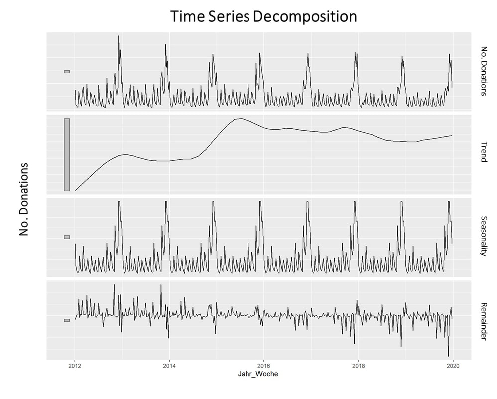
What is clearly visible in the charts above is a degree of seasonality that is obvious in the third box from above but already striking in the overall chart (No. donations, first on top). The second chart from above shows an overall upward trend in the data.
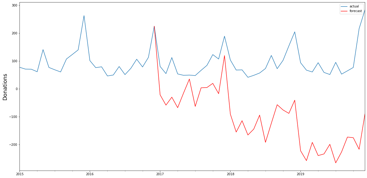
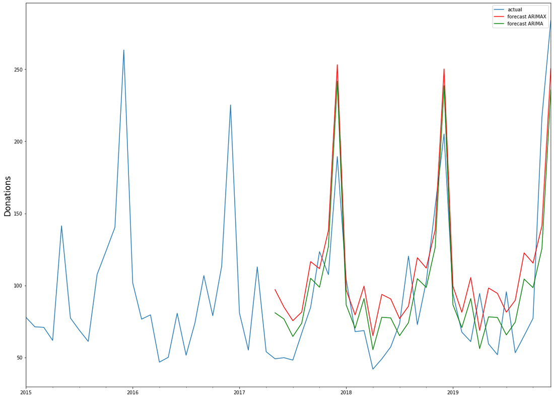
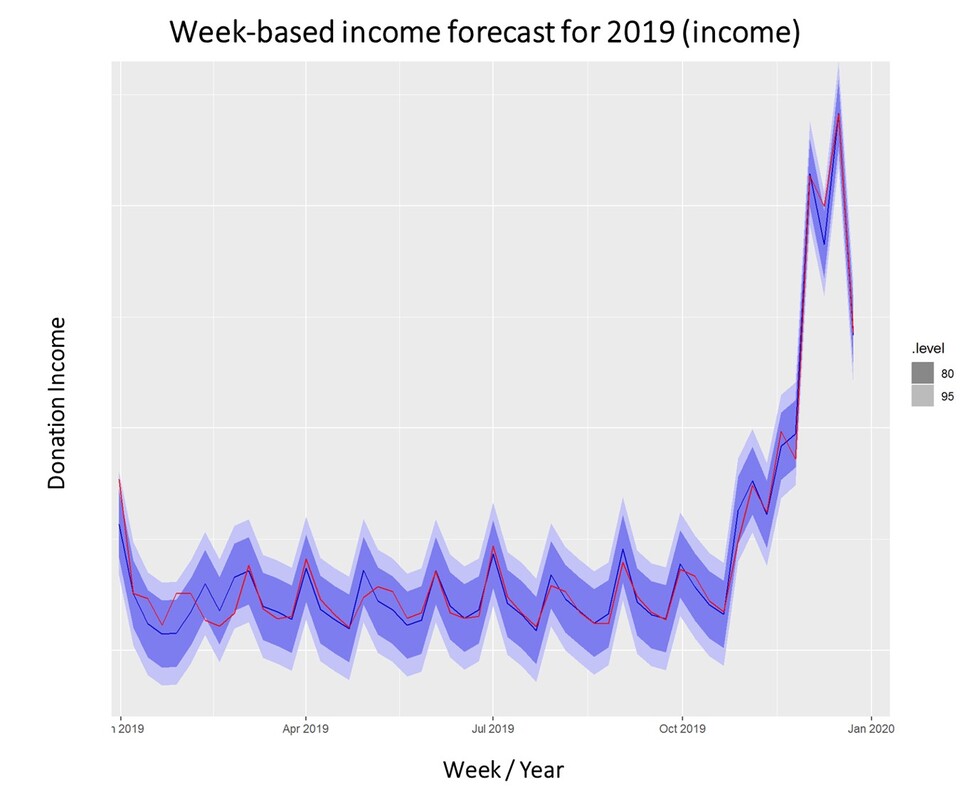
For research purposes, we decided to use the data from 2012 to 2018 as "training set" and use ARIMA to generate a prediction for the already closed year 2019. We did that both on the level of accumulated donation counts and donation sum per week. The week-based prediction for the donations looks like this with the blue line being the prediction and the red line being the acutal data:
For research purposes, we decided to use the data from 2012 to 2018 as "training set" and use ARIMA to generate a prediction for the already closed year 2019. We did that both on the level of accumulated donation counts and donation sum per week. The week-based prediction for the donations looks like this with the blue line being the prediction and the red line being the acutal data:
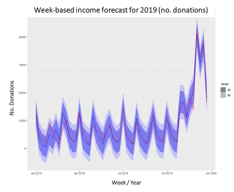
The chart above shows that the blue predicted line generally runs close to the red line representing the actual data. The actual data also oscillates within the forecast prediction intervals at 80% and 95% confidence levels. This is what the actual and predicted data look like for accumulated income over the weeks 2019.
Conclusion
To what extent can a time series approach inform fundraising planning and decision making in times of a highly dynamic environment coined by the Corona pandemic? Well, it is still quite unclear how global economy and different countries will develop in the near future. It is also yet to be seen how the Corona crisis will affed fundraising markets on the mid- and long-run. In essence, time series can be an interesting approach to come up with a sophisticated analysis on the extent of the deviation from normal income level, most probably caused by Corona in a direct manner (e.g. face to face fundraising currently stopped) or indirect effects (e.g. rising unemployment) ...
To what extent can a time series approach inform fundraising planning and decision making in times of a highly dynamic environment coined by the Corona pandemic? Well, it is still quite unclear how global economy and different countries will develop in the near future. It is also yet to be seen how the Corona crisis will affed fundraising markets on the mid- and long-run. In essence, time series can be an interesting approach to come up with a sophisticated analysis on the extent of the deviation from normal income level, most probably caused by Corona in a direct manner (e.g. face to face fundraising currently stopped) or indirect effects (e.g. rising unemployment) ...
We wish you and your dear ones all the best for these challenging times. I think that it is now more than ever worthwhile trying to turn Sophie Scholl´s quote into an attitude: One must have a tough mind - and a soft heart.


The good old days of Web 1.0
A world without the WWW is hard to imagine for most of us - although it is not that far away in the past. I get a little nostalgic when I think of setting up my first email address back in 1999. Back then the world was like this (ok, this is quite some time ago ..).
Some 20 years ago, the overall number of websites around was ridiculously low for today´s standards. To get any idea about how a page was performing, web marketers had to rely on things like the notorious visitor counters or wrangling log files created by web servers. The latter was definitely a hassle as access to these files was required in the first place, configuration file hacking or programming was necessary, only static reports etc.
Data-driven Digital Fundraising today
Nowadays the common denominator for most organizations having a digital presence is definitely running a website. In a context of marketing and sales as well as fundraising, this page often acts as kind of hub to which other digital channels and communication activities point. Running a website requires sound management. And as management is in essence a data-driven discipline, an evidence-based approach also is key in a web context...
This is where Google Analytics comes into play. It has the capacity to answer questions like these for online fundraisers and decisions makers in general:
Google Analytics is free in its base version which suits many use cases of websites. For big data applications, there is the even more powerful tool called Google Analytics 360 as part of the Google Marketing Cloud.
All you need to set up Google Analytics (free version) – apart from a website you have the ownership for of course – is a Google Account and the possibility to embed the little Java Script code snippet that does the magic. This can either be done by yourself or a web developer. Frameworks like Wordpress or Weebly (where this blog runs on) make life even easier through assistants. For the ones interested in what is happening under the hood, this infographic might be interesting.
Google Analytics in a nutshell
Google Analytics is embedded in an ecosystem together with tools like Google Tag Manager, Google Adwords etc. This is particularly the case on in a more advanced and differentiated online fundraising context.
Google analytics offers a lot of potentially insightful reports out of the box which can be used from day one. The main areas are:
Learn more
There is a plethora of resources from Google and other providers to take a deep dive into Google Analytics. These are a few:
Advanced Analytics @ Google Analytics
Google analytics can moreover also be interesting in a broader analytics and data science context. Think of the following uses cases:
To cut the long story short, analysts, data scientists etc. working in a fundraising context should - in addition to the digital fundraising experts taking care of the website and digital channels - care about digital data analyses in general and Google Analytics in particular. As 2020 just started - let´s get cracking! :-)
All the best and keep in touch as asykourdata.co or johannes.spiess@sos-kd.org.
Johannes
A world without the WWW is hard to imagine for most of us - although it is not that far away in the past. I get a little nostalgic when I think of setting up my first email address back in 1999. Back then the world was like this (ok, this is quite some time ago ..).
Some 20 years ago, the overall number of websites around was ridiculously low for today´s standards. To get any idea about how a page was performing, web marketers had to rely on things like the notorious visitor counters or wrangling log files created by web servers. The latter was definitely a hassle as access to these files was required in the first place, configuration file hacking or programming was necessary, only static reports etc.
Data-driven Digital Fundraising today
Nowadays the common denominator for most organizations having a digital presence is definitely running a website. In a context of marketing and sales as well as fundraising, this page often acts as kind of hub to which other digital channels and communication activities point. Running a website requires sound management. And as management is in essence a data-driven discipline, an evidence-based approach also is key in a web context...
This is where Google Analytics comes into play. It has the capacity to answer questions like these for online fundraisers and decisions makers in general:
- How did users find and get to the site?
- Who visits the website and when?
- What kind of traffic does the site generate?
- How do users behave once they are on the site?
- How do users interact with the website, how engaged they are?
- What are the most and least interesting pages?
- What drives conversions? Who is most likely to convert?
- ...
Google Analytics is free in its base version which suits many use cases of websites. For big data applications, there is the even more powerful tool called Google Analytics 360 as part of the Google Marketing Cloud.
All you need to set up Google Analytics (free version) – apart from a website you have the ownership for of course – is a Google Account and the possibility to embed the little Java Script code snippet that does the magic. This can either be done by yourself or a web developer. Frameworks like Wordpress or Weebly (where this blog runs on) make life even easier through assistants. For the ones interested in what is happening under the hood, this infographic might be interesting.
Google Analytics in a nutshell
Google Analytics is embedded in an ecosystem together with tools like Google Tag Manager, Google Adwords etc. This is particularly the case on in a more advanced and differentiated online fundraising context.
Google analytics offers a lot of potentially insightful reports out of the box which can be used from day one. The main areas are:
- Realtime: This is where you will find live data, i.e. see how many users from where with which devices, where they came from etc. are on the respective site right now. It is a good point of entry particularly for beginners, last not least because it is fun to play with. Real-life use cases might imply portals with peak days of traffic (e.g. Black Friday, Giving Tuesday etc.)
- Audience: This is the node where you will find demographic, geographic, structural and technological information about the users on your site. The menu looks impressive at first glance, certain information (e.g. age and gender) requires the activation of additional tracking in the respective account. This might affect the privacy policy of your respective site. Sociodemographic data like age and gender are mainly derived from people who are logged in to a Google account and from third-party DoubleClick cookies (user tracking cookies).
- Acquisition: This node helps you understand where your organization is acquiring its visitors, i.e. whether they coming via search engines, display advertising, social media, partner links etc. This is also where to look for specific campaign data in case this is relevant for your site.
- Behaviour: This node contains reports on how visitors are interacting with the content on the respective website. It includes information on the “user journey” of visitors and might provide insights on how they experience your site.
- Conversion: This node holds more advanced reports that require the setup of Goals and / or Ecommerce Tracking. In case you have one or several clear-cut “fundraising sales objectives” with your site, using these reports is definitely beneficial. The Conversion section does not only provide information on so called Goal Completion but shows the path users took until they converted, i.e. the so called sales funnel.
Learn more
There is a plethora of resources from Google and other providers to take a deep dive into Google Analytics. These are a few:
- Google Analytics Academy
- Google Analytics Support
- Youtube Channel about Google Analytics
- Blog about Google Analytics
Advanced Analytics @ Google Analytics
Google analytics can moreover also be interesting in a broader analytics and data science context. Think of the following uses cases:
- Create insightful and easy-to-use dashboards for various audiences using tools like Google Data Studio or - our favourite - Microsoft Power BI.
- In a context together with a CRM-system, analytics and decision makers will be interested in what the real digital sources of “fundraising sales” (e.g. committed gifts) are. In many cases, the labelling of the respective signups is as general as “digital”. This definitely does not account for all the digital channels, their specifics and the differentiated measures they require.
- Getting raw data from Google Analytics to apply data science methods such as time series analyses to predict website traffic, apply clustering methods, tailor attribution models based on insights generated from your conversion data etc.
To cut the long story short, analysts, data scientists etc. working in a fundraising context should - in addition to the digital fundraising experts taking care of the website and digital channels - care about digital data analyses in general and Google Analytics in particular. As 2020 just started - let´s get cracking! :-)
All the best and keep in touch as asykourdata.co or johannes.spiess@sos-kd.org.
Johannes
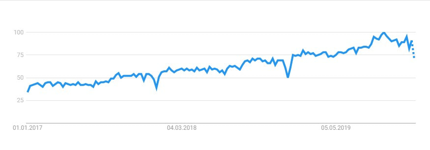
When we started this blog some three years ago, data science was widely seen as a mere buzzword. The interest in the concept seems to be here to stay – and grow steadily. Google Trends shows how the interest in the search term Data Science has developed in the last three years:
Data Science is here to stay
We think that Data Science is more than just a fancy term for statistics and agree with the popular blog KDnuggets: Data science is about creating value through data and supporting digital transformation of other processes in a company such as marketing, customer service, production etc. We believe that the positive impact of advanced analytical methods is something that can be generated across industries and is not limited to the corporate sector. Earlier this year, we discussed the adoption of advanced analytics by nonprofits. Given the already existing relevance of data science, we asked ourselves what 2020 might bring - and found some interesting hypothesis on the web.
Take everyone onto the Data Science Journey
According to towardsdatascience, some 100 papers on Machine Learning were published in 2019 on a single day. This reflects that Data Science as a whole is here to stay. Hand in hand with increasing presence comes certain differentiation. The mentioned blog sees a trend towards specialization among different roles in data science. On the one hand, there are experts on bringing models into production and providing the necessary infrastructure. On the other hand, there are people involved in investigative work and decision support.
The footprint of Data Science is getting larger as models are becoming an indispensable part of business operations. This implies the ongoing challenge to further increase model performance, the possible need for model retraining or rebuilding as well as continuous levels of support for model stakeholders.
We mentioned before that Data Science is essentially about turning data into value for the respective organization. This value creation is, according to towardsdatascience, not only dependent on the “physical technology” consisting of algorithms and data flows. The “social technology”, i.e. effective lines of related communication and decision-making or executive awareness (or even better, a basic understanding provided by interesting in-house-trainings in Data Science) are at least as important.
People and Tools are needed
Data Science is done by Data Scientists. According to a study by IBM, the demand for Data Scientists will grow by some 28% until 2020 (compared to 2017). Some might go as far as to call Data Scientists the “sexiest job of the 21st century” – like Harvard Business Review did back in 2012. Regardless of any labels, it can be expected that the perceived shortage of expert staff will remain in 2020 both across industries and on a global level. The good news is that further developed self-service tools will gradually improve the ease of data preparation, exploration, visualization and modelling.
Natural Language Processing
Most people think of structured information in rows and columns when they hear the term “data”. In fact, an unbelievable large amount of unstructured data, i.e. texts, speech, sounds and videos are produced every single day. This also applies to different forms of personalized data and general customer communication. A powerful approach to make most of unstructured data is so called Natural Language Processing. It is essentially about classifying texts in categories, sentiments, similarities etc. What happens under the hood is that characters are translated into numbers and further processed by models such as Neural Networks. Breakthroughs in Machine Learning and emerging libraries like Tensorflow have drastically increased the possibility to apply NLP models to unstructured data.
Data Privacy and Security as relevant constraint
There is no data science without data. The “raw material” for analysis and models is often personal data, be it from customers or donors. Particularly in a European context, the public has become more aware and careful regarding the ownership of personal data. The ongoing challenge for any kind of organization involved in data science is to keep highest data security and protection standards, aligned with best practices and being transparent upon customer request. If organizations stick to that, there is no need to become paranoid about data protection at the same time.
What is it that fundraising nonprofits can do or learn about Data Science in 2020?
We think that a classic quote by Mark Twain gives valuable hints into this direction:
The secret of getting ahead is getting started. The secret of getting started is breaking your complex overwhelming tasks into small, managable tasks and starting on the first one.
No matter how far away you see yourself away from applied and sophistiacated Data Science, it definitely will pay off to be even more data driven in 2020 and beyond. As we outlined earlier this year, there still seems to be a competitive edge in the industry for "analytcial NPOs" (see our blog post for facts and figures in this regard if you are interested. Do not hesitate to ask experts or organizations you trust for guidance - also joint systems will be happy to help throughout 2020. :-)
We wish you merry Christmas holidays and a good start into a happy, healthy and successful 2020.
David Weber and Johannes Spiess
 |  |