|
Visualizing data in maps can be a bit of a challenge although widespread tools like MS Excel recently got improved functionalities in this context (see for example our blog post called Where the donors are from earlier this year). There are two R packages that are definitely worth taking a look at when it comes to producing maps with data. The first one is called Leaflet. Leaflet is an open-source JavaScript library for creating and customizing interactive maps. These maps can be used directly from the R console, within R Studio as well as in in so called Shiny Apps and R Markdown documents. Leaflet is becoming more and more popular, probably also because of its use in online media (see these examples from the NY Times and the Washington Post). Using Leaflet is fairly easy. A very simple example shows some of the major cities I have visited on a world map and attaches a little comment popup to them. The data underneath is straightforward (longitudes, latitudes, comment) and the code is quite self-explaining. Click on the Image below to see the interactive result: Another recommendable package is Plotly (also spelt Plot.ly like its URL). Plotly is a virtual data analytics and visualization tool. The platform as such invites to play around. Plotly contains libraries for languages like Python, Perl and MATLAB and last not least a package for R. I have created a simple example with made-up data on the number of potential beneficiaries per country on a world map. This is the result (click image below): There are sources with way more impressing showcases than mine, e.g in the R Graph Gallery. Three examples I found inspiring in a broader fundraising and charity context are maps with illustrations of Nepal earthquakes as well as a London income map.
The possibilities with Leaflet and Plotly seem limitless. I have made the experience that working with the two – after some initial tweaking with the data and getting used – is really fun!
2 Comentarios
A good sketch is better than a long speech. Napoleon Bonaparte The idea behind the good old proverb about the picture being worth more than a thousand words might be way older than the actual idiom or Napoleon’s quote.
The world has become highly dynamic and connected. This turns the communication of complex topics and interdependencies into a real challenge. Times that brought us (in my eyes terrifying) terms like „alternative facts“ make it more important than ever to convey information in a form that enables and catalyzes reflection, discussion and eventually change. Data visualization can help us to see concepts and facts in a graspable and interesting way, be it about climate change or refugee migrations across the Mediterrenean Sea. Apart from this "educational" function, visualization are often just fascinating as well as beautiful and moving. I will frequently blog about this topic and can, for instance, highly recommend David McCandless site called Information is beautiful. 
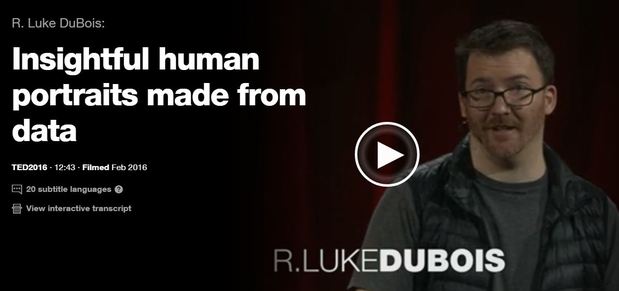
Artist R. Luke DuBois transforms data into artworks. In his talk DuBois shares nine very different projects from American presidents to Britney Spears. He also reflects critically on the way we use data in our culture. Just click the picture above to see the artist in action. By the way it is worthwhile to check out his website that contains other projects: lukedubois.com/ |
This website uses marketing and tracking technologies. Opting out of this will opt you out of all cookies, except for those needed to run the website. Note that some products may not work as well without tracking cookies. Opt Out of CookiesCategories
All
Archive
February 2026
|

