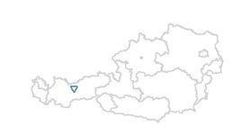
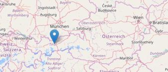
 Varanasi, India Varanasi, India Sometimes maps are a suitable mean or even necessary tool to visualize data. A vast number of software is available for what is often termed location intelligence. Renowned applications like ArcGIS from Esri, the tools from Pitney Bowes or Tableau are powerful - but are of course not available for free. If creating maps is not really an essential part of the analytics you do on a regular basis but maps are the tool of choice once in a while, there is a number of alternatives one can look at. Good old MS Excel includes a functionality to visualize map data since version 2016. As soon as the data is ready in Excel (I used data from Statistics Austria for population on postcode level) it is fairly easy to create different types of plots. The picture shows a heat map (i.e. the closer an area is to red, the higher it is populated). 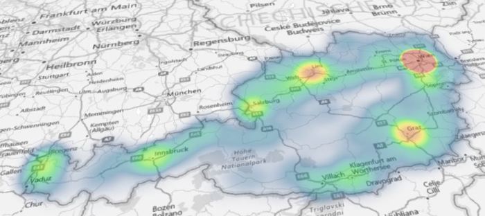 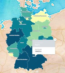 I also came across a cloud-based platform called Carto. It took me some hours to get used to the handling of base data and map styling. After a while it got easier and easier, looking backwards it is a straightforward and intuitive tool. I used data from Destatis (the German equivalent to Statistics Austria) to obtain population data on federal province level. The nice thing is that generated maps can be published and embedded online which I have done here. Last, not least there is a number of R packages available that aim to make the data scientist´s life easier when it comes to spatial data. The package ggmap which is a package for creating maps with ggplot2 (the plotting workhorse of R) is worth mentioning in this context. I also found leaflet, which brings open-source JavaScript libraries particularly interesting (see pciture below on the right). It is actually also possible to do some basic plotting without any further ado using R “standard” (see left map).
There are also country-specific map packages around. A very nice example I have found is from Italy and plots the number of wineries per region (and made me think when the next trip to Italy might be :-) 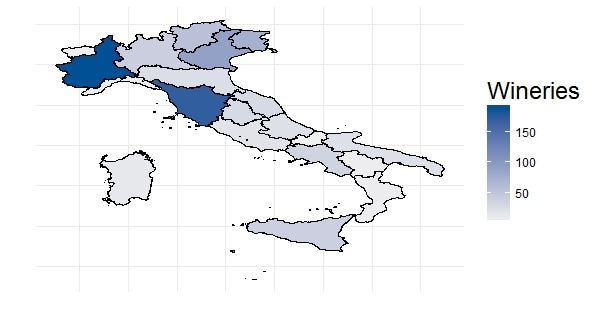 If you are interested in R Code or how-to-information, please do not hesitate to get back. I´d also look forward to shared experiences with mapping tools, spatial data etc. Just go ahead and comment :-)!
1 Comment
|